Would the device assignment page make more sense rotated 90 degrees?

Hi all,

I’m a software engineer, formerly at TASCAM, MOTU, and Google, who’s new to the MOD Dwarf. I’m very impressed so far and looking forward to writing my own plugins.

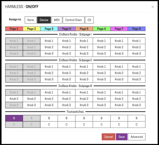
I was staring at the current device assignment page for a couple days:

trying to figure out why something felt a little off. I just realized what it is: the direction of the knobs, subpages, and footswitches go downwards on screen, but on the Dwarf hardware these controls all go across, from left to right.

So I mocked up a screen in Google Sheets to see how it would feel if the controls went across, and the pages went downwards:

This feels more natural to me, since moving from knob 1 to knob 3 on the device moves from left to right, and the same with subpages and switches B and C. It helps to have the Dwarf in front of you when you look at this.

What do you think? Which one feels better to you?

19 Likes

interesting… i agree!

whenever i’m sketching out control layouts in a notebook, i also do it in a way that is more reminiscent of the hardware (even if not exactly the same). so, yes, your suggested layout does feel more natural and releases some of the “cognitive dissonance” between the device and the GUI.

:clap:

3 Likes

As someone working closely with software UX designers, I fully agree!

It’s this kind of “small” adjustments that can turn the user experience from “ok” to “great” :slight_smile:

5 Likes

as discussed many times before:

The whole page should have a different workflow. Best option would be to have one assignment page where you select the plugin and parameter you want.

6 Likes

short answer: yes; it is far more intuitive (to me at least) if it is horizontal and with a color label
Begint able to see the assignments would be a plus too.
Your suggestion looks like a very feasable next step indeed

Thanks all, glad I was able to explain what I was thinking and you seem to agree.

@LievenDV, that’s a good point about being able to see existing assignments. How about something like this:

It does seem to help display the current mappings versus the current implementation which just greys out boxes that are not available.

Is this a viable change to pursue?

4 Likes

Yes also support this. Agree it’s counterintuitive and validated that thought yesterday actually when I came back to a pedal I made up a while ago, which I’d designed sympathetically to the config screen in the browser, top to bottom, then came to use this again a few weeks later, directly on the device, and wished the options for the same device were configured ‘across the row’.

3 Likes

And then there was silence

Yeah, unfortunately that’s been the case with my other bug reports and suggestions, even super easy ones like this. I’ve just stopped reporting issues for now and I’m barely using the Dwarf either. I really hope they get back to new firmware releases for it, it’s been silence for 5 months or so. :frowning:

You wrote that you’re a software engineer. The code is open source, so you could try to make the proposed changes yourself. Just saying… :slight_smile:

I just had a look into the repo. The device assignment table is build by the function buildDeviceTable. I’ve never done anything with JS, but this doesn’t overly complex. I’ll not have any spare “hobby time” for the next two months, but after that I may be able to give this a try myself. If nobody else does it first… :wink:

The code is open source

And how many people have been able to compile a custom firmware so far?
Code might be open, but toolset, build pipelines, guidelines, documentation, autotests that would allow to deliver changes to the hardware reliably - are missing. Also to my guess there are some proprietary vendor blobs, firmware for the display/buttons and stuff which are closed.

For example,I was looking to make some simple modifications in the python code on the MDX side to add a couple of API functions, just to find that there is no plain python code in the box, but compiled pyc files that i cant modify. Yes, code for these files are in repository, but it does not help a lot to add a couple of python lines, even if I know what lines i want, as I cannot deliver them.

It is very far from “just fix a couple lines in js”. Unless you are a seasoned embedded linux enthusiast you are likely to brick the box by blind attempts. Knowning just JS or Python is not enough.

Also, with each new update/release you would have to rebuild that custom modified verision of yours, maintaning it constantly to keep up, unless change is merged to the main stream.

That’s something I’ve bumped into with my wifi kernel module i had customized with disassembler to accept a new dongle revision, and some bash fixes for bluetooth I made for myself to switch pairing mode.
Each new release means you need to start from the scratch. It is too much of a sidetracking in a long term.
In my case, wifi kernel module had been fixed permanently by MOD on my proposal, but for bluetooth I just gave up, as I cannot maintain that fix forever even for myself when it is washed away each time when a new release comes out.

Therefore, for user fixes to be viable - there should be a designed way for accepting them into main MOD repo, and established process of developing/building/accepting which we do not have. Maybe MOD Desktop would lead to that later, allowing community effort to be a part of the platform development. But currently it does not work this way, so suggesting “fix it yourself” is unlikely to be a solution at this point, unfortunately.


As for something that actually can be done - probably, best current bet to rearrange interface “on your own” would be a greasemonkey script that rearranges interface on the client site, just in browser.
1 Like

imho, you don’t need to deliver anything. When it comes to the mod-ui, the repo’s readme claims that it can run stand-alone without any hardware dependencies. So, I’d try that, create a branch, do my changes, test them running stand-alone, and finally create pull request.
Reviewing that PR would be much less work for FalkTX than implementing the requested change himself.

I don’t see the problem. (Changing an existing table in the UI with JS is something else than adding API functionality, I’d say)

1 Like

I understand that this is low prio BUT it does contribute to a smoother learning curve.

I refrain from calling it “easy” or " a small fix" when a company has other high prio items on its list.
It can be frustrating than knowing something is a small and useful job but not in line with the current strategy. Part of making a strategy work is keeping at it and knowing when to adjust course.
I do believe this (and MANY) good ideas on this board “suffer” from that but because of the greater good.

@Jandalf I would happily make contributions myself if I thought they would be accepted. But MOD has made it clear that they don’t want help with the core product. I totally understand that it can be hard to manage submissions from many people who may not stick around to maintain them and who might want to make changes not in line with the company’s designs.

While the suggestion I made in this thread would be a nice enhancement, I don’t think it’s a critical change. In fact I would much rather they focus on serious issues, like the glitches and artifacts I hear when changing between snapshots. That alone is bad enough that I wouldn’t use the Dwarf at a gig today. Or being told to disconnect USB when it’s already disconnected as I documented here. The only software progress I’ve noticed on the forums is on the desktop app which I’m not interested in, so I hope they get back to device support soon.

2 Likes