i hope this is the correct section to suggest changes to the UI? if not, please let me know
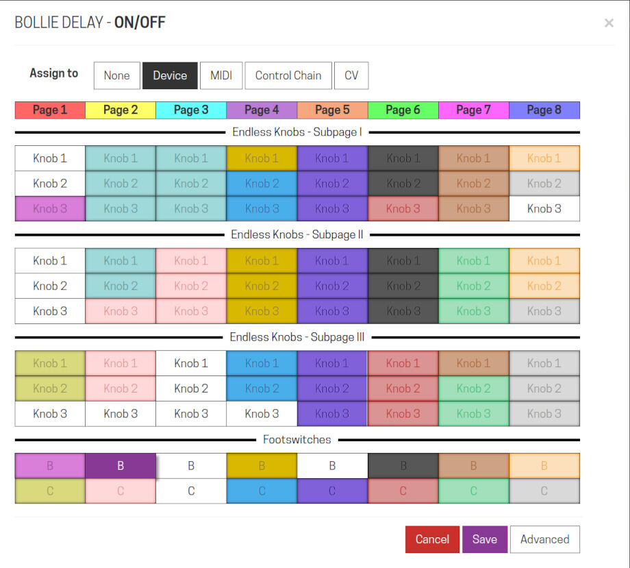
i would like to suggest to add some more info on current assignments of parameters to the device so you can see not only which knobs and switches are occupied, but also which ones belong to the same plugin. i’ve made a quick mockup of how this could look like:
same color means same plugin. if possible, context info in a mouseover tooltip could also explain which plugn/parameter is assigned to a knob or switch.
as i was building my own pedalboards, i repeatedly had to rearrange these assignments, and currently with all grey cells it’s a bit painful to figure out which plugins could go where to make some space. this would help a lot with that, i think.
of course it would be even better if you could drag&drop these assignments; if a cell is unused, move it here, if is is already used, simply switch places. but until now, i don’t dare asking for that
i just dropped it over to the Feature Requests category, and added a “gui” tag… i think a lot of regular users might ignore the Developers category and, well, it is actually a Feature Request!
just thinking more about this… somehow encoding that kind of information in the assignment dialog would, as you point out, have real advantages as we build up our assignments for a pedalboard. i’m worried that it would be easy to run out of clearly distinguishable colours in complicated pedalboards with many plugins… any more ideas about that? what about if there was a way for the user to assign the colour for each plugin? then we’d have the option to group some plugins within one colour, and/or to leave some assignment boxes just the default grey. maybe that’s actually a way to make the thing even more meaningful, since there’s some “designability” available?
the tooltip is a great way of presenting more details, while keeping the display uncluttered.
yes, autodefining colors could be a bit tricky. i would probably like this to be a mix of a default color defined by/from the plugin itself, and still the possibility to manually configure/deactivate it. most plugins, when you look at them, appear to be colored in a certain way, some are orange, some red, some green or black… i would expect the colors in the assignment dialog to roughly match the “mean color” of the plugin GUI in the board, even if some might turn out to look similar at first. but that would kind of connect these colors to what you see on the board. in other words, these colors would immediately make sense.
the tricky part could be to calculate a GUIs “mean color”, though.
I think this is a great idea, and I’ve had similar thoughts about how tedious it might be when I’ll need to start remapping pedalboards around to optimize for my workflows.
I’ll add an alternative suggestion. Assign colors to the various plugin categories and use those to color in the squares using each plugin’s primary category (example: Delays = Green, Reverbs = Blue, Modulators=Purple…). Using a smaller font, you could also fit a 2-line informative label inside each square like:
Great idea! There are only a handful of colors to be easily distinguished under bad light, though. Additionally, (?) a bounding box with an individual style could be drawn around each pedal (with assignments). The same style could be incorporated on the page you showed.