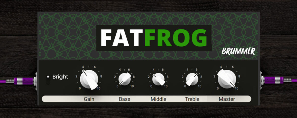
Interesting pattern on that amp.
The buttons are nice; I kept the existing ones as buttons are part of the controls and we are limited the the ones that exist and I didn’t want to go there for now.
Interesting pattern on that amp.
The buttons are nice; I kept the existing ones as buttons are part of the controls and we are limited the the ones that exist and I didn’t want to go there for now.
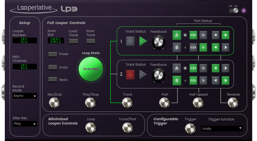
I really like this style. It looks super clean and modern. I like the switch on the left, its a much simpler style of switch that is easy to read. Its a good example of something being tailored towards usability on a GUI. Like the switch does not need to look like the one on a real amp, it just needs to look like a switch and indicate which position it’s in. This is actually my favourite style of switch for GUIs. So much so that I convinced Andre to use it on the Looperlative GUI haha
I think the bottom half (controls section) is ver nice. The top is nice too but you could still iterate on that to maybe add some depth (3D texture, shadows etc)
The overall aesthetic is consistent with itself as well as with some of the other newer plugins on the platform. I think the colour scheme is pretty well suited to the frog theme too.
@James
It sounds like we’re on the same wavelength here.
This approaches an interesting middelground.
The top half needs some depth, character and identity but
I’ll probably take a stab at it again this weekend.
These iterations are an interesting process, especially when managing expecations.
Although we focus on one plugin here, the process itself is valuable and an interesting case study for the MOD guys ^^
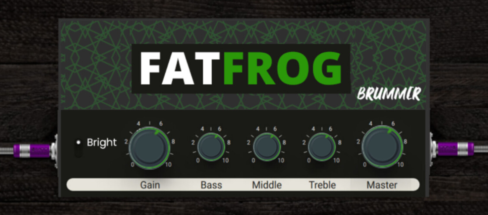
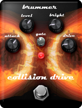
The only thing is that the controls are different on the Fat Frog. The switch should be a bright switch and there is no presence knob. Also there is only a master, no volume (they are the same basically). So I would remove those 2 knobs and make the whole thing less wide. More like the “lunchbox” sized amp which I think is ideal for amps so they aren’t so huge compared to pedals
Here’s a quick and dirty edit
One of the main reasons for the style guide we want to make is to set a max size for amps so they are less wide like this. I never heard the term “lunchbox amp” until @LievenDV said it here but I think that Lunchbox amps are ideal for the MOD web GUI. If there are more knobs needed then just make a second row of knobs
I think this is also a good example of a nice mix between
A) being recognisable as an amp
B) being practical, easy to read and tailored towards usabilty in a GUI
idd, they have an optimal size.
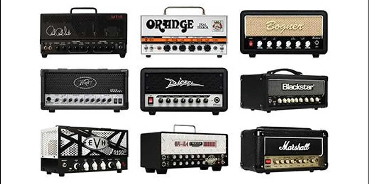
The term has been going around for a long time and it has been a novelty for a while but last couple of years, the mass market offers interesting stuff. They gained credibility in the High gain market.
They set the trend for guitarists being tired to dragging all that heavy gear around.
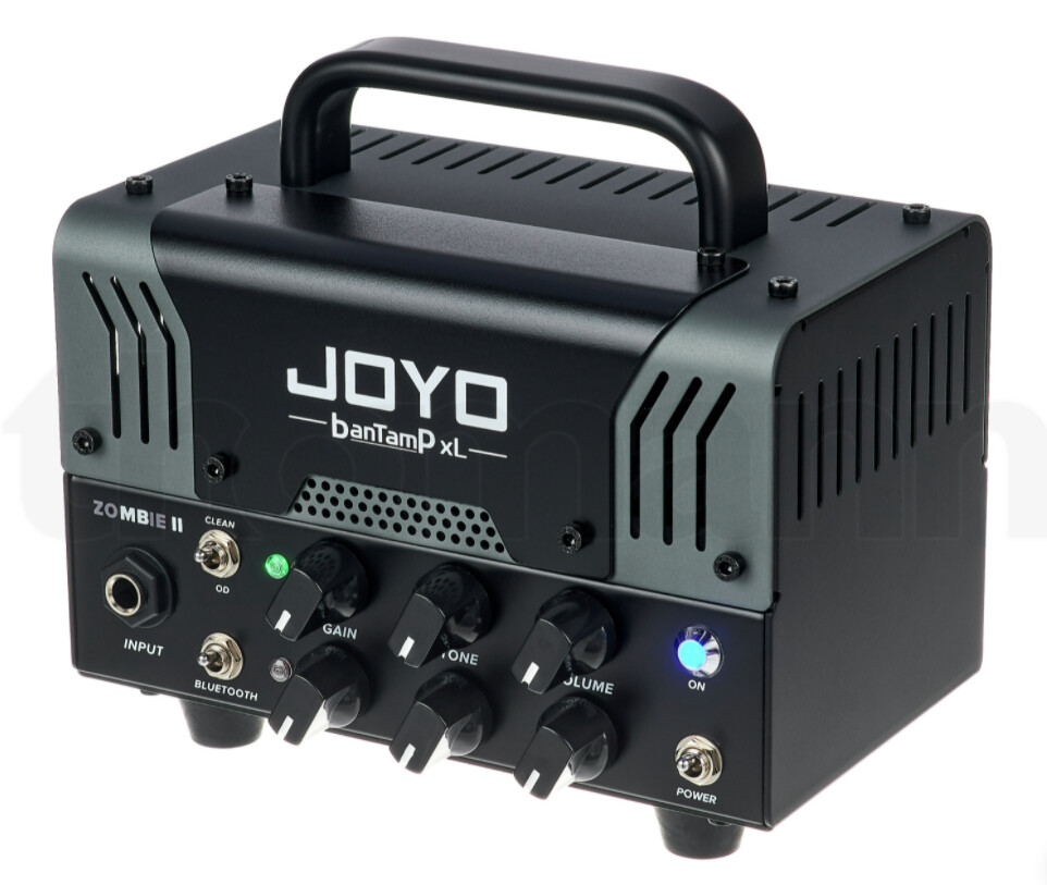
I have the V1 of this Joyo “Zombie”, that emulates a Mesa Boogie.
use it on a 2x12, sounds awesome for what it costs (€160!) and our lead guitarist was considering getting one himself.
As someone who has been following this thread since the first post and without a single idea of visuals and stuff, I agree that this is the best option. Easy, simple but recognizable.
+1 for the Joyo. V2 is my main practice amp. Works great with the dwarf.
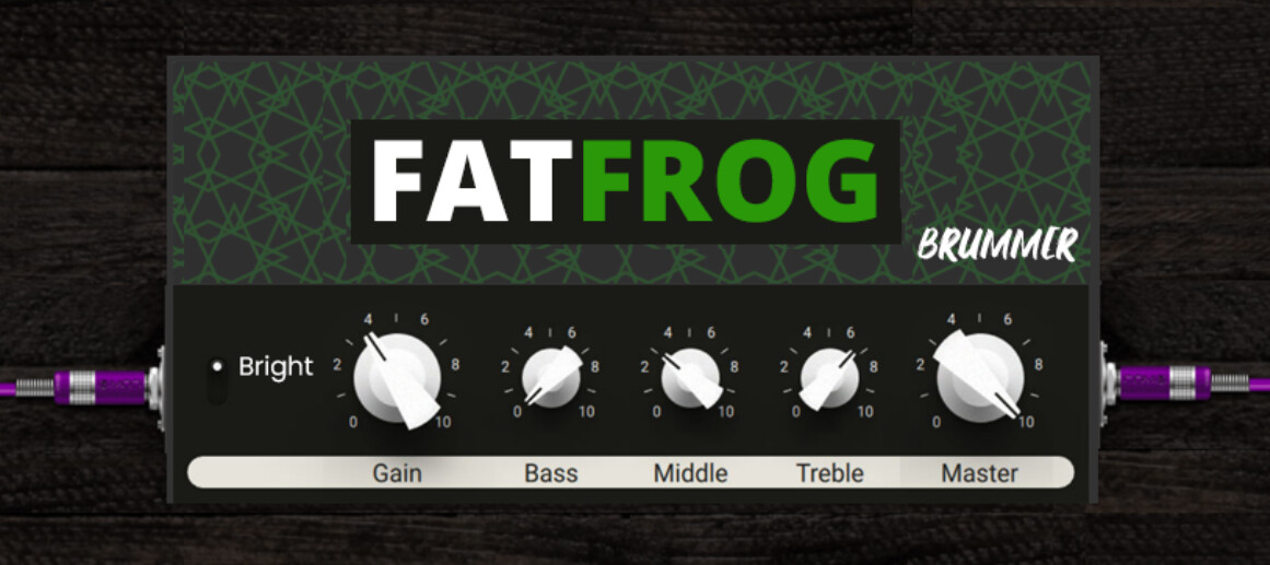
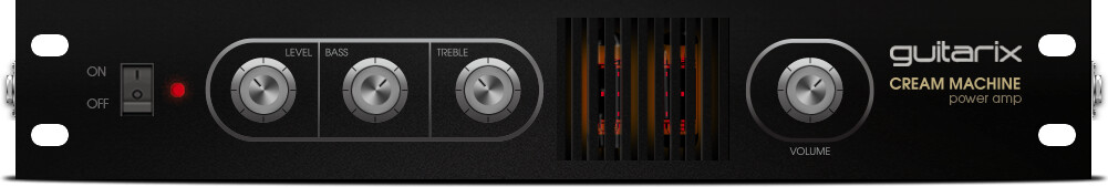
As I said @James the knobs are straight from Guitar Rig 6 - so you do have to change the style a bit.
I know it’s @brummer s work but maybe changing the knobs to a stylized look after the knobs used on the Dwarf and DuoX Hardware connects it more to the platform - more cleaned up and prettier of course but you know.
I liked the white buttons more…
I agree these are the 2 main (opposed) goals that plugin design must try to achieve
Also, I agree even more to this.
Good GUI design has the need, other that eye satisfaction and functionality, to take care of what in physical UIs would be called ergonomics: the science that study how the device is good enough to be operated by humans.
Lots of effort is out in perfectioning the ergonomics of joypads, phones, steering wheels, and anything we have to operate. In PC/Web GUIs this means perfectioning color schemes, accents, control position and dimensions…
in the last design iterations the only flaw I can see is that the knobs could be hard to read in the pedalboard, especially without zooming. Some other color on the knob to indicate position might help.
Take for example the subtle update Falk made to a plugin recently.
Before:
After:
Just adding that red line makes the actual value stand out immediately. Sometimes a little detail goes a ling way.
I tend to agree but he will need to find some royalty free option
I like the illustration used here but I think it would be nice to steer away from these old templates if I’m honest.
The template is made to look like a Hammond box but the curved edges are not really how they look IRL and the scratched texture is over exaggerated. Like it is intended to look realistic but in the end it looks less realistic.
Also I think it would be nice to steer away from knobs and footswitches that are angled. Since some pedals are not angled and no amps are angled, it gives this weird impression that there is perspective only sometimes. It would be more consistent if every plugin looked as though you are looking directly at it with no angle perspective and it would look more like all the plugins exist in the same world
Your work with the images is great though!
I agree, this subtle change makes it much more readable. I think in general, knobs don’t need to have so many fancy details, they can just be a circle with a line really. Although a little bit of style is nice
@James I agree to all. The problem is the time. To use templates is a quick solution. Maybe we should create a new library then. If I take a look in the Beta-store we need lots fo designs. Thus, we must be quick not spend the whole lifetime with it. A vital and re-newed library would be very helpful and saving time.
100%
That’s the plan with the Design Guide. Basically we would specify the design guide and then use that to make new templates so that it’s easy for devs and/or community members to create new GUIs that fit the new style guide
But indeed this needs time. I think the work being done here will inform the style guide and then the new templates
I think about one difficulty if the knobs are no more visible slightly from the side. It is the footswitch…
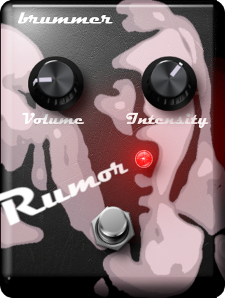
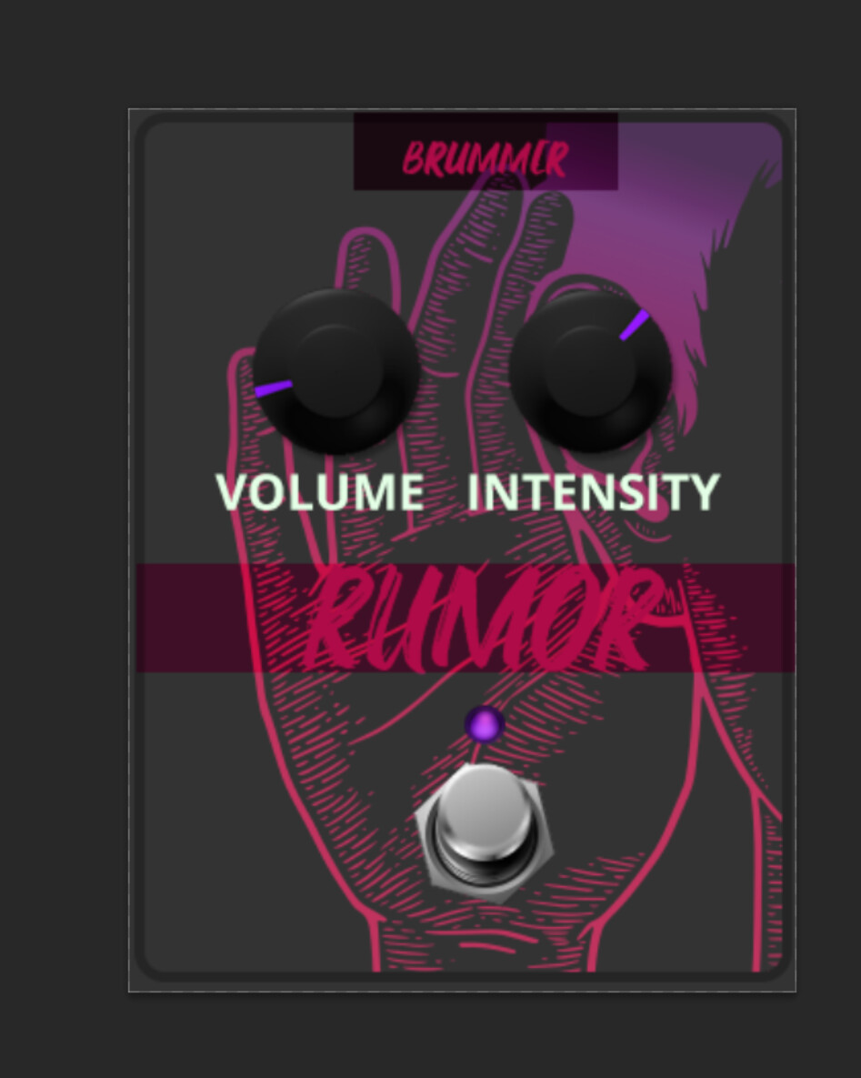
sorry @Kim to hijack you design for the RUMOR here but this is the first thing that pops into my head
… and also the first image in the google search. So again just an idea with assets that are not mine.
On a note for the Design Guide: keep it simple and don’t try to reinvent the wheel.
If you break it down to the simplest form: a Pedal is just a shape with a border. A switch is just a circle with a border. A knob is just a circle with a border and an indicator.
Further down the road: This is what all css frameworks do, with more or less style options. And I think that the road for the mod sdk at the styling site. A simple css generator.
It can still work without angle. You can see this on the Looperlative
This looks pretty cool!
Actually mostly it will be about defining the scales of things. Not so much about the details of the aesthetics
I have found a 3d-model of a chicken head knob in our 3d-library. It is modelled by my company, thus, it is roalty free. We create some renders (cheicken head knob in white). I will post them here after finishing.
This looks cool to me. (Still the on/off switch is missing). I like the idea of having a line up for the controller titles. Nice.
Very nice. Still while the angle doesn’t look 100% right between knobs and foot-switch (still a issue in the mod-sdk), I like it very much.
I don’t think so. Those templates gives a nice shape for a pedal laying on the floor.
But that doesn’t look like you’ll ever use it with your foot. I thing we should differentiate for that.