This goes beyond the scope of this topic (“Plugin Artwork”) - But I personally would like to see a GUI toggle that switches from pedalboard view to a ‘rack’ type view similar to Carla.
It would be similar to the plugin parameter settings view we already have, with the standard black/purple knobs with square parameter layout, but laid out in a rack configuration.
Each parameter could have a ‘show in rack mode’ toggle so we could only show parameters that the user deems important.
This would make it a single-page view with quick and easy access (even on a tablet/phone) to control all ‘important’ parameters across all plugins.
Also, user-assignable colors to change the purple accents per plugin would be helpful in this view.
Think of it as a “control view” as opposed to the current “pedalboard construction view”
I realize this is a much larger request than just design guidelines, but thought I’d put it out there.
I think I fall in the middle between you and @Kim here
I’m all for using known patterns, that’s how you know where to find a knob even before reading the labels. The logo left top on a website is the home button. The leftmost knob in a row of controls is the gain in.
…but I like that bit of character that makes respects the well known patters while it adds a sniff of character. a small icon or a different background color alone wouldn’t suffice for me to make it stand out. I can also imagine the effect it would have on the largest portion of the target audience when marketing the GUI
Although I think this is a very interesting discussion, I think we are exceeding the scope of this topic Perhaps an idea to split this topic, starting from @Tarrasque73 last post and make that one about the design philosophy of the GUI?
I tend to sit in the middle too. Our experiance and feedback from customers and retailers is that Guitarists want something that looks like what they are used to. The same statement can be made about pragmatic buyers in general. You may know about this if you have read “crossing the chasm”. Basically you want the minimum amount of friction when transitioning new users. They want what they are used to with a little extra.
In general, I think that amps that look like amps and have the same control layouts as popular real world amps will perform the best on the platform. It doesn’t need to look 1:1 like a real world amp but it should be recognisable as an amp. Proportions can be changed to eliminate dead space and make things easier to read and click on a screen. The colour, textures and design do play a significant role in how people perceive the quality of the plugin. If it looks cool, it feels good to play with it. In a lot of cases, something looking cool can compensate for a lack of audio quality (KRK rokit studio monitors ) which speaks volumes about the psychological effect that a GUI has on a user
In short, try to make it look recognisable as an amp, put the controls where people expect them to be, it’s okay to remove dead space, adding character helps
It’s always interesting what different directions discussions go when you do something unexpected…
The graphic is completely modular and can be changed in many directions at any time. I have built the controllers in such a way, as it was apparently already arranged with cavemen on amplifiers.
However, I wonder how often you actually turn the knobs. I use them two or three times when I’m playing music, but only when I’m connected to the PC. Most of the time I’m not even connected… I personally don’t depend on high detectability. I just turn the knob until I like it. Finetuning is not done on the small frontend anyway, but in edit mode or directly on the device.
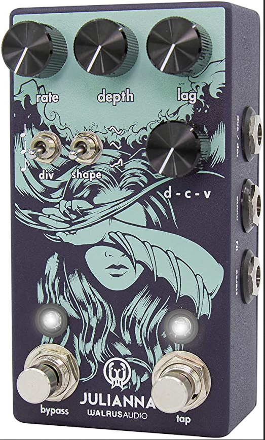
And yes, I love EyeCandy and I don’t know what’s wrong with this! Why does a Walrus Audio pedal consist almost only of EyeCandy? …and they are damned successful for this reason.
I’ll wait for brummer now. Maybe he also has no desire for something extraordinary, then I’m out anyway. But it was worth the few hours for me, I had fun!
…and please confirm that I did particularly well with the cigarette smoke… it is painted!
I’am also a little bit torn here. I like the “flashy and loud” design from @Kim . It’s useful while browsing the pluginstore or at a quick glance of the pedalboard. You don’t have to look twice whats what. I personally would like a more subtle approach like @LievenDV suggested. I think It’s more of getting used to like any pedal or amp you work with in the real world. In the end if you dont like any interface just map every knop to the device/midi/touchosc and you are good to go. Granted you have to spent the time to map everthing before you can dive right in but that ok for me.
I somehow understand both sides and also like the “form follows function” approach. But if you browse the currently exisiting pedals: How many frogs, other animals or not-function-optimized designs do you find?
Agreed – frogs should not be the norm but a few outliers are OK in my book.
This is a completely different matter, which I think supports my POV a lot, in facts.
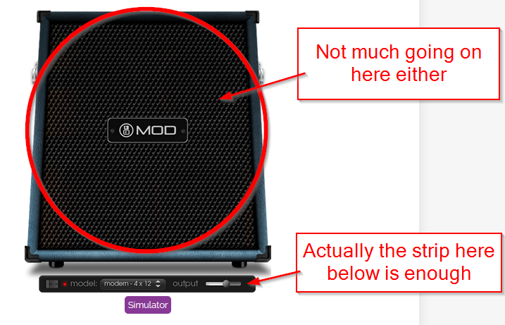
These pedals, like all others, are built with very specific physical constraints. They need to have regular sized jacks for audio connections. They need to have decent sized and spaced footswitches for foot operation. The same for knobs for hand operation. Footswitches and knobs must be fairly distant in order for the user not to crush them. All this without even considering the physical room needed by the internal components.
What does this need? That no matter the technology advances, a pedal will have minimum size requirements. Which translate to lots of empty space. Which is better filled with an image than left empty. Yuu are not taking anything away from a pedal by painting an image
All this does NOT apply to a PC plugin. Your design more than doubles the space the plugin occupies in my pedalboard, and my device’s screen, for absolutely no added value except showing an image. That’s the difference.
Hi @Kim
Sorry for delay in my response.
Well, I really love how the frog comes out, it’s really ‘in your face’.
Still I think that this design didn’t suite the representation of a amplifier simulation.
While as a pedal design it works great, in the amp design it becomes to restless. When I look at it I must think on a DJ-tool instead a amp. Even if it looks great with the cigarette and the smoke.
Yes, I think so as well.
So, sorry @Kim, I think I’ll go with the design pattern from @LievenDV for the FatFrog.
But, maybe, you like to do such a fancy UI for the Rumor pedal, for that, the UI can’t be strange enough, as, it is a pedal, it produce strange sounds.
regards
hermann
@brummer: I did learn a few things from this thread. It was a fun excursion into foreign realms, but I think I’d better stay in my gaming industry, where there’s a lot more imagination possible than here. You’ll find someone who will design your really fantastic plug-ins. In any case, I’m no longer involved (some people are breathing a sigh of relief right now ).
Don’t be discoraged @Kim; I love your enthousiasm and It would be a shame that you gave up on this because I challenged the concept.
I can imagine you designing A PEDAL that offers the the combo of “classic expected layout” and “fresh graphics” like the Warlus Audio pedal you posted.
It is wild but monochrome; a compromis.
I think your designs should have a compromise too; your amount of quirks might be too much when having “many” colors, knobs in an arc, green buttons, leds etc.
I think pedals lend themselves better to dedicate that percentage of “real estate” to quirkyness and graphics.
Let’s continue to challenge each other; this is not a competition but a place to find each other
I find my design still just a tad too “bland” and your design on the other side of the “compromise” inspires me to improve it, bring a bit more panache, a more vivid element or something…
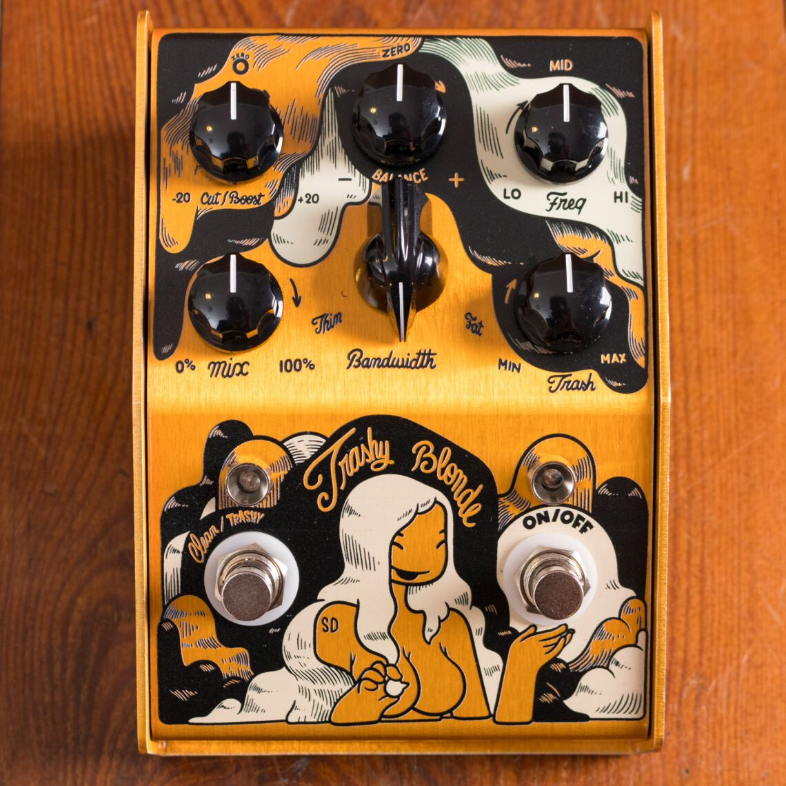
Take this Trashy Blonde v2 pedal for instance. It is, without being a pedal, an excellent illustration and an upgrade from their v1. It’s design just falls short of “the compromise” though.
it uses mostly 2 color and a color very close to the enclosure color.
I find the knob section somewhat confusion already though.
The control layout is ALMOST on one line but it’s the colors there that make it a bit busy.
Finding that balance isn’t easy and manufacterers do hit n misses themselves.
Wanna see a gallery of hit and misses? Check Dr. No effects
yeah, that is a compromise too:
it’s a graphic but it is not a picture, it’s an illustration with a certain simplicity.
The simplified lines and the early 20th century cartoon esthetic are the signs of well thought concept
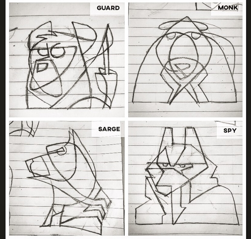
Simplifying lines is a fun challenge btw. For some boardgame design concepts, I tried giving animals a “role” and express them with simple lines:
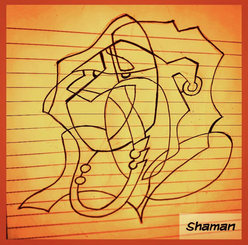
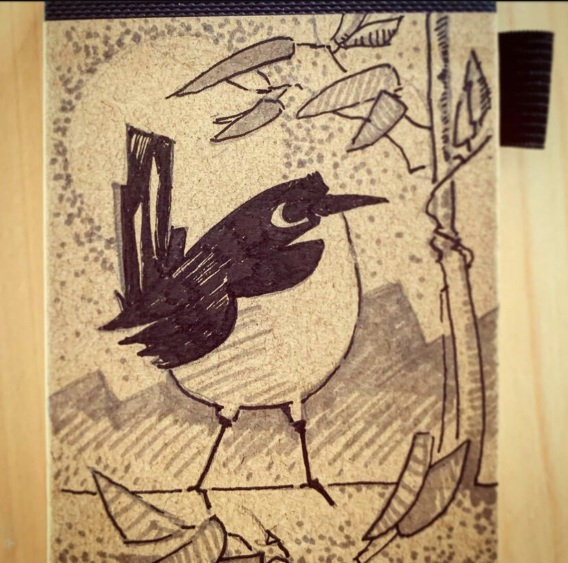
Even though 2 shades of a color still work best on a pedal. This could be the sketch of center graphic of a treble boost (a small drawing on a notebook)
Hi! interesting to follow this debate/reasoning. Yet I fail to understand why one thing excludes the other. Couldn’t the plugin be released in both versions, and the “tin can” version for that matter? Then one could also see what the public actually prefers over time. I personally think the plugins would have a stronger/longer “memespan” (I don’t know if it is really a word) when they stand out visually as original artworks. The frog will definitely stay with me as it has a strong visual imprint. Maybe not quite “Pepe” but that’s probably a good thing Personally the visual side isn’t so important for me, as i like my pedalboards as clean as possible. But to see you guys visual creations is a great edition to this forum. Which I already enjoy a lot, for some reason. Must be the strong atmosphere of co-creation and supportive problem solving! BTW I think a lot of people might love the possibility to “paint” pedals here in their own fashion. As far away from music as it may sound. Could/should modularity be restricted?. Especially when seeing how music is developing. We used to make songs and albums, now we create pedalboards/modular patches/soundscapes for others to navigate and play with. So why not a “cover” or visuals to go with the “creation”? Although it somehow touches on the phenomenon of territoriality and identity. Sorry for being a somewhat off topic philosopher. Just my creation of words this evening! Stay creative and keep keeping on!
Well one can never be sure where’s thoughs originate. It stood between that and “memeability factor”. Just envisioning how these great devices can reach even more people. And the internet works in mysterious ways. Don’t underestimate the power of bad/good design/taste and frogs
The current multi-fx market is basically turning into UI wars. Sound quality-wise, a decade-old technology can still be useful to professionals (Kemper), and the newest, most powerful kid on the block (Quad Cortex) is not blowing pro-level tech from 7 years ago (Helix) out of the water when it comes to the sound. The newest Boss product (GX-100) does not offer any technological leaps in the realm of sound quality when compared to their flagships from like 4 years ago, and all of the improvements are in the UI realm (colored touch screen, Helix-like material design UI, more streamlined approach to signal-chains).
I know that the MOD team is small and they have their days full, and I’m not even a MOD user anymore (I briefly considered diving back in given how hard it was to get an HX Stomp with the chip shortage, though this topic coupled with no MOD-team driven progress in the amp-sim department, cured me of that notion) but what this topic is about should probably be a top priority.
 ) which speaks volumes about the psychological effect that a GUI has on a user
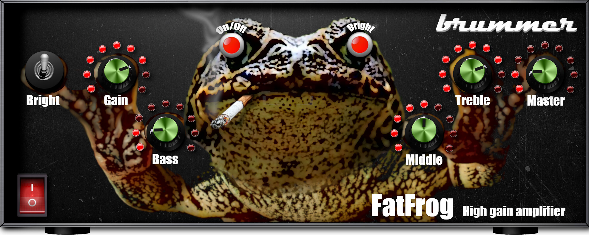

 ).
).
 Personally the visual side isn’t so important for me, as i like my pedalboards as clean as possible. But to see you guys visual creations is a great edition to this forum. Which I already enjoy a lot, for some reason. Must be the strong atmosphere of co-creation and supportive problem solving! BTW I think a lot of people might love the possibility to “paint” pedals here in their own fashion. As far away from music as it may sound. Could/should modularity be restricted?. Especially when seeing how music is developing. We used to make songs and albums, now we create pedalboards/modular patches/soundscapes for others to navigate and play with. So why not a “cover” or visuals to go with the “creation”? Although it somehow touches on the phenomenon of territoriality and identity. Sorry for being a somewhat off topic philosopher. Just my creation of words this evening! Stay creative and keep keeping on!
 And the internet works in mysterious ways. Don’t underestimate the power of bad/good design/taste and frogs