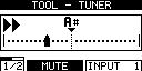
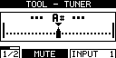
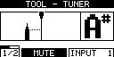
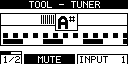
cool, an interface question ![]()
“way off” setting,
“slightly off setting”
and “spot on” (with a clear visual indication it is “spot on”)
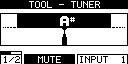
alternatively
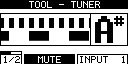
cool, an interface question ![]()
“way off” setting,
“slightly off setting”
and “spot on” (with a clear visual indication it is “spot on”)
alternatively
A good information is to show the deviaton also as Number in “cents” and maybe later if available the adjustable basic frequenz with format xxx.x Hz.
eg “419.2” for semitone deeper 
Haha I thought you might like this!
The arrows like this would be pretty nice
We might even be able to expand the bounding box a little bit to have more space to make a gap between the scale line and the black box around the note letter. I think Jesse generally tries to go for a 2 pixel gap between the bounding box and it’s surroundings. Not sure if there was a specific reason that it is smaller on the tuner
What about a pitch over time design? Or a rotary tuner design? Maybe a rotary design could be a straight line instead? What about a design where the note letter is the full height?
This is one of the best features of the Peterson Strobostomp HD. I can see that note name a mile a away. Sorry… 1.6km
When I said rotary tuner I meant to say strobe tuner, my bad
Hello James, unfortunately I could not get the display to work due to my lack of knowledge of using said app.
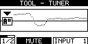
The idea that i had was instead of having 1 display with multi things showing, Have the 2 displays side by side, one display with the tuning increments and the other with the Note Name. Now in actuality there won’t be 2 displays side to side, just 1 on side showing the tuning increments and the other side showing the tuning note and how far away you are from it being in pitch!!
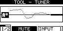
What you have will still keep the note name too small.
I guess that your example is meant for the MOD Duo or the MOD DuoX. This is the tuner screen of the MOD Dwarf and there you only have one screen.
Anyway, interesting to see if we can also think of something that applies nicely to the Duo and DuoX (I guess that on those it could be the same)
this x42 plugin seams quite good :
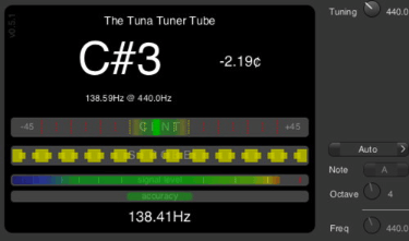
this android app is the tuner I prefer on this system :

(I just look at the bottom graph !)
Everything you need - usable for every instrument. 
You probably have to consider the resolution of the display.
The android type doesn’t seem realizable to me.
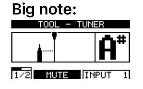
Big note:
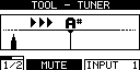
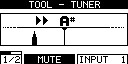
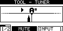
Line:
Strobe:
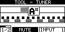
strobe v2
I like the Big note with the Strobe
Question is, is a strobe even feasable, considering:
Good point. I like the big Note  But in all honesty, I don’t plan on ditching my Strobostomp HD, so I don’t really have a strong opinion on this.
Hey Jon, no the pic was intended for the Dwarf. It was not meant to be a double screen it was meant to be 1 screen with half the screen with the note name and the other half with the tuning increments
Hey @jon and @James is an UI requirement the header title has 128px? It could be smaller for the tune note be bigger? In same way, the footer is also required to be full height?
About the frequency/hertz, where it can be show?
The header and footer are consistent across the whole system so they should not change. The bounding box could be slightly expanded though possibly. @jesse could comment on this
Gotcha ![]() Thanks for clarifying. You got me confused when you talked about 2 screens, but now I understand that you meant devising the Dwarf screen in 2.
Thanks for clarifying. You got me confused when you talked about 2 screens, but now I understand that you meant devising the Dwarf screen in 2.
I am very interested in the Mod Dwarf… however there is one tool that would seal the deal and that is a Universal Tuner like Lingot or FMIT that can read SCL files. The reason being is that I need a tuner capable of getting the correct pitches for 19 edo and 31 edo.
both Lingot ( [LINGOT Is Not a Guitar-Only Tuner Universal tuner) and FMIT (Free Music Instrument Tuner) are standalone apps
GTUNE and X42 are my favourite plugin tuners but neither support microtuning
It is my opinion that a Tuner for recording and live performances is an extremely important function that most every guitarist needs. It’s pretty much the guitar’s on button. It’s the first thing I do before playing as guitar strings tend to go out of tune even when idle.
As I am also moving into other tonalities I require a Tuner that is adaptive in this sense (or universal) .
Is adding such a tuner, one with SCL reading or microtuning capabilities, something that the DUO team would be interested in considering?