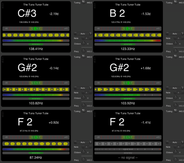
I support this wish, especially if you sometimes play with brass or string ensemble, this is vital and currently only realisable with external tuners.
Some people also like to play a semitone lower (e.g. me with an ageing voice), so a lower fundamental frequency would be very desirable.
Let’s hope that the tuner fixes makes the next upgrade! I like that the Mod Dwarf is small, but if your going to use it as more a foot pedal, then the Mod Dwarf should be bigger so that you don’t have to bend to adjust like it’s a table top unit. Or something to that effect. For example the Neural Quad Cortex is a unit that has a small blueprint. I believe a updated Mod Dwarf could be some where in size between the current Dwarf and the Q. Cortex. And still keep the web based GUI!!
We thought since you guys have some ideas about the tuner, we should just share with you an image of the current design so you can edit it to demonstrate how you think it could be
Just a note from Jan, there is a delay between incoming signals and updating the display which can make it hard to have a really fine resolution on the tuner. Just keep that in mind
The image is the actual resolution of the display (128x64) and is a bitmap so just edit it by placing only black (on) or white (off) pixels in your prefered image editor

If you want to try a browser based editor you can import it into
https://www.piskelapp.com/p/create/sprite
cool, an interface question 
“way off” setting,


“slightly off setting”

and “spot on” (with a clear visual indication it is “spot on”)

alternatively


A good information is to show the deviaton also as Number in “cents” and maybe later if available the adjustable basic frequenz with format xxx.x Hz.
eg “419.2” for semitone deeper 
Haha I thought you might like this!
The arrows like this would be pretty nice
We might even be able to expand the bounding box a little bit to have more space to make a gap between the scale line and the black box around the note letter. I think Jesse generally tries to go for a 2 pixel gap between the bounding box and it’s surroundings. Not sure if there was a specific reason that it is smaller on the tuner
What about a pitch over time design? Or a rotary tuner design? Maybe a rotary design could be a straight line instead? What about a design where the note letter is the full height?
This is one of the best features of the Peterson Strobostomp HD. I can see that note name a mile a away. Sorry… 1.6km
When I said rotary tuner I meant to say strobe tuner, my bad
Hello James, unfortunately I could not get the display to work due to my lack of knowledge of using said app.


The idea that i had was instead of having 1 display with multi things showing, Have the 2 displays side by side, one display with the tuning increments and the other with the Note Name. Now in actuality there won’t be 2 displays side to side, just 1 on side showing the tuning increments and the other side showing the tuning note and how far away you are from it being in pitch!!
What you have will still keep the note name too small.
I guess that your example is meant for the MOD Duo or the MOD DuoX. This is the tuner screen of the MOD Dwarf and there you only have one screen.
Anyway, interesting to see if we can also think of something that applies nicely to the Duo and DuoX (I guess that on those it could be the same)
this android app is the tuner I prefer on this system :

https://f-droid.org/en/packages/de.moekadu.tuner/
(I just look at the bottom graph !)
Everything you need - usable for every instrument. 
You probably have to consider the resolution of the display.
The android type doesn’t seem realizable to me.
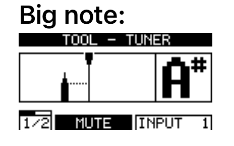
Big note:

Line:


Strobe:

strobe v2

I like the Big note with the Strobe 
Question is, is a strobe even feasable, considering:
Good point. I like the big Note  But in all honesty, I don’t plan on ditching my Strobostomp HD, so I don’t really have a strong opinion on this.

Hey Jon, no the pic was intended for the Dwarf. It was not meant to be a double screen it was meant to be 1 screen with half the screen with the note name and the other half with the tuning increments

Like LievenDV Posted! The note name is big!
Thanks to LievenDV for providing a great idea for the tuner display!!
