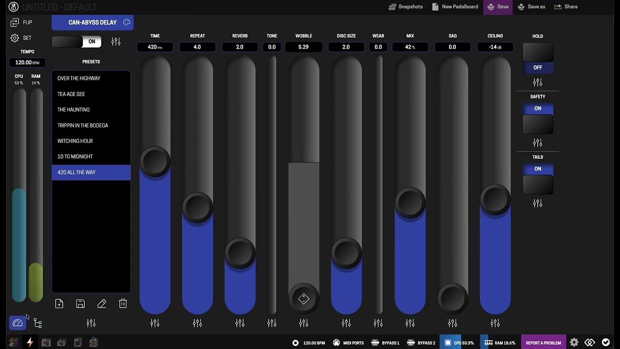
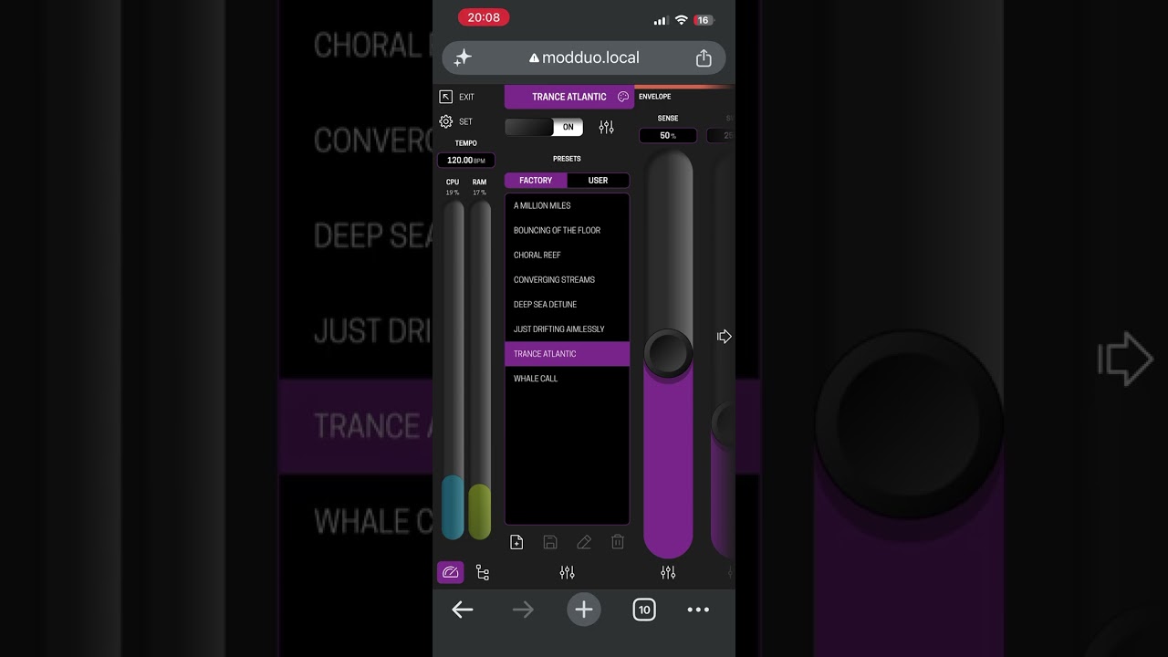
@AndreaDelSignore I didn’t want to derail the thread in "Performance view (version 1), so I decided to create a new thread that is actually a bit more specific to what @Abotte already picked up on.
I have been doing some more work on better utilising screen real estate at various screen sizes, especially smaller screens that might struggle with some of the orientations. I’ve also been experimenting with how certain components behave in order to make it nicer to work with.
I thought it was a good moment to just do a little brain dump so my thinking is out in the open for the benefit of collective understanding. Here are some of the core ideas that drove this initial concept.
- It had to be for phone/tablet first.
- It had to feel inviting to use.
- It had to still feel like part of the MOD OS
Some of the component and feature ideation
- Sliders instead of buttons. Much better control for touch devices and less awkward for mouse use as well. scroll wheel already is more naturally aligned with an up/down movement.
- Smarter controls. Minimise and lock unused sliders, clearer status feedback on bindings. click and hold for micro adjustment (x5 slower movement) and the active parameter change enlarges for easy read out.
- Personalised surfaces. Like Andrea already suggested the control surface should be able to have a hint of the front of the pedal, or a colour that is useful to you.
- Proper preset browsing. List over the full height is way nicer to explore presets.
- “System/Path bar”. Especially the path bar has quickly become my favourite. it simply allows hopping to the previous/next connected pedal without leaving the edit surface. That way you can “hop the chain” with minimal clicks. I think I’m going to explore how to refine this so parallel chains are visible. Maybe even grid diagram in a slide out tray to quickly jump to a location.
- Full screen carousel. Still a nice way to immerse in the feeling of a physical effect or stompbox and a way to have a curated selection of surfaces. This is also great for plug ins where the controls make more sense if they are on a specific surface.
Overall, after using it for a couple of days, it feels intuitive to me. Would be interesting to see/hear other’s thoughts on some of the thinking, and if it holds up with what I think I want vs a larger group. I have added two videos of it running on a tablet sized window and on my phone (iphone 13, pretty small)