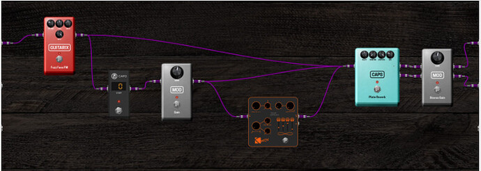
Also I think the trend here seems to be that on a display, information density is preferred over 1:1 skeumorphism. It would be nice if you can have more plugins in view at a practical zoom level for interacting with them
For me, as a user, it is not the priority to have the screen full with controls. Ascetic could have a great space in it for my taste. Just because some people say they like it more flat, it isn’t to be taken as a trend. Many users like the MOD especially for it’s outstanding UI.
In this can I’m not referning to the flatness of the desing but more to the information density. It could still be a semi skeumorphic desing while having a higher information/control density. I will try to make a little photoshop example
I didn’t want to comment but after brummers post, i decided to write my thoughts.
I think the same as brummer. This skeumorphism is one of the reasons that I checked the Mod devices even. If the graphics would have been the same as Line6, HoTone, Neural etc. etc. (all are doing the same) I maybe would not have even checked it. This kind of graphics is one of your absolute unique selling points. It leads to something that also makes a physical pedalboard so attractive: from the combination of different designs you create your own, new design. Your principle is diversity, not uniformity! You can of course abandon that, that’s your decision.
What I do wish as a man who put some real work into it. @James When I read your post, I had to roll my eyes. What was that all about…? Why do you have to write this especially at the time after even more work has gone into it? Why not before? And why would you want to let the community design something if you don’t want diversity at all and know exactly how it works? … then you have to do it on your own, it is as simple as that…
I agree with you. I’m not trying to suggest uniformity. As I said, this for me was a matter of information/control density, not about the design aesthetics. I think your design looks cool. I have no intention of abandoning the style, I keep trying to explain this. Skeuomorphism is great, it just doesn’t have to be 1:1 skeuomorphism.
I apoligise for that, I don’t work on the weekends and while I do often check the forums, this weekend I have been very busy preparing to travel to Australia to see my family.
I do want diversity and I don’t want to discourage you, I’m just trying to make suggestions that you could implement in your design style to make it more information/control dense
I have an example. So the record-stereo plugin as it currently is, is quite small which is nice because it is nice and simple and has very few controls
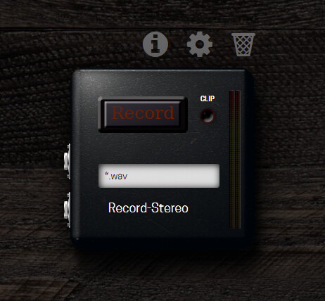
So you could adapt this into a skeuomorphic style GUI that is still compact
Take this tape recorder for example (sorry it’s a low res image from google)
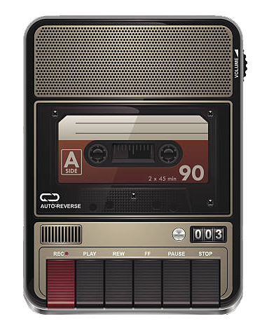
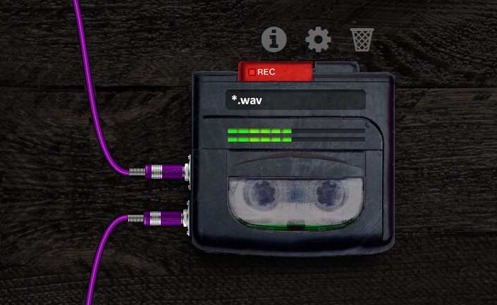
You could use something like this as a base for inspiration. We don’t need a lot of things on this so we can remove them while still keeping it looking like a real world device, just not exactly how it was. The plugin doesn’t actually need a tape so we can replace that space with the file names. It also doesn’t need a speaker so we can remove that. It doesn’t need a mic grill and a counter so we could replace that with a peak meter
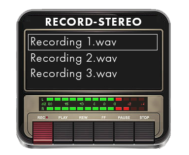
You could have a list of file names there for recently recorded files or you could just keep it as 1
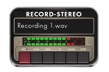
You could also remove the other buttons too
I’m not trying to say use this design, it’s just a quick photoshop example. The intention is to keep the skeuomorphic style (something resembling a real world device) while optimising for on screen and on pedalboard use (information/control density). The design principle to explain this is called “Form from Function” where the functionality informs how it should look
I have no doubt you could come up with something better than this with your 3D modelling and rendering skills
I am just showing this and having this discussion to try to encourage new ideas. In design we never get things perfect on the first attempt. Actually the final design for the Dwarf was version number 15. It’s good to go through iterations. Please don’t be discouraged when I or anyone else gives you feedback. It’s not to say your design isn’t good, it’s to say here’s an idea about how I think it can be improved. That’s how we can collaborate, give each other feedback on designs and improve together
On the other hand, other users, like myself, are just about tolerating it’s UI, which is one of the worst I know of, because of it’s hardware and sound qualities, so one has to consider both ends of the spectrum.
I was meddling with something before other tihngs got posted here so I didn’t go in persuit of something.
I’m still fond of a “best of both world” where it “feels” real but the dimensions get changed to improve usability. It doesn’t need to be crisp, high contrast all the time, as long the core functionalities are easy to find and operate. The rest is distraction.
I’m not pushing a design, I’m merely illustrating the difference in approach when it comes to contrast
I kind of liked the concept of the low contrast of the original that was easy on the eye. It didn’t distract you because it was “a utility” on your board. Pedalsboards could ge busy. This one shouldn’t be drawing too much attention. The recorder wasn’t the kid on the playground screamign for attention but was there and you could always count on it
I also liked the small, square lay-out.
I tried to capture that “low profile old faithful” into a reduced and compact dictaphone/walkman format.
looking back to it, the record button should be a bit more to the left but yeah, didn’t invest much time in this yet because how this thread was going.
I noticed that it might mismatch the clean style of the GUI right now but I like the simplicity and the clear indicators of “record”, filename and levels.
Perhaps you explained my thoughts better here than I could have  “feels” real but dimensions changed to focus on functionality maybe
Maybe something we could put in the style guide is an overall information/control density percentage to aim for. Like say 60% as an example. So there should be no more than 40% unused space. Just an idea, no idea what number would be appropriate yet
I quite like this design. Just an idea, maybe the “filename” part could be on the tape or on the tape lid to make it even more vertically compact
Good idea.
Funny, I was toying with the idea earlier but didn’t get anything decent the first minutes.
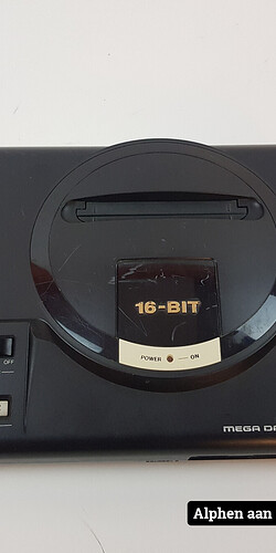
It give me the "old used Sega Mega Drive vibe. (Genesis for US people)
I’ve enjoyed seeing your ideas and work - even if I wouldn’t desire to see them as part of my interface. I can see you’re getting frustrated, so hopefully some friendly advice taken from some of my own life experiences.
Try to keep your expectations low when bringing unsolicited work into a community. Even though people might respond positively initially, there can be numerous steps in between “this is nice” and “this is ready for production”. Implicit requirements, team culture, development costs, fear of change, roadmap priorities, branding decisions, etc. can all greatly the skew the perspective in between those two endpoints. I can understand why it might sting if you put non-trivial time into something and then didn’t get the reaction you hoped for. It might help to share your ideas sooner as rough sketches and get feedback from the MOD team.
Have you ever had or been part of a moment where someone presents a nice gift and even though the receiver appreciates and acknowledges the gesture, it isn’t something the receiver would like to have? It can feel awkward, even though everyone’s intentions were good.
One thing I wonder about that I don’t see discussed here much is what are the differences in development and design costs of going the “generic vector” approach vs. the skeumorphic approach? I don’t know if I’m qualified to quantify, but I suspect the overall costs are much higher for the skeumorphic approach. As this thread illustrates, there are numerous considerations in terms of asset renders - device resolutions, scaling, lighting, unique styling, and overall aesthetics. Considerable time has already been spent discussing the design for just a few plugins and very high-level requirements for future design standards. I feel like some of the competitors listed above avoid all this tidily by using simplified interfaces. I suspect - a personal guess and anecdotal data from reading through numerous product reviews - that the overwhelming majority of players judge the quality of the product almost, if not entirely, on the tone they get from it. The competitors have likely recognized this and are more focused on competing on tone quality, customization and ease of workflow.
I honestly worry that for a small, pandemic-challenged startup like MOD, each hour that isn’t spent on delivering or improving the core product becomes a liability. Every time MOD has to review someone’s design and write feedback or request changes it takes time away from developing requested fixes, features and workflow improvements
I hope you can put yourself in my shoes momentarily. I’ve been waiting 2 years (as of April1) for a Dwarf so seeing debates about pictures of frogs and tape recorders starts to feel like bikeshedding to me.
Amen to that. I had a similar post typed out but felt It has been discussed numerous times before - the goal is to simplify things, both for devs and users, not add more obstacles to the workflow.
and there isn’t much difference in optical quality either.
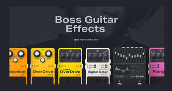
Just an example: (not mine, all vector)
@Kim I know you put a lot of time into this but don’t equal effort with quality. I often had stuff that I put a lot of work into just brushed off as not suited for the need- which in hindsight was absolutely right.
These look great!
Imagine these being “compacted” and made more sensible in a digital interface, like in this ugly copy/paste frenzy:
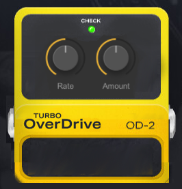
It finds the middle between the real thing and the digital interface
I like the smaller pedal a lot, it looks like I’d be able to fit a lot more of them before a zoom out on the gui
I agree with this so much. I returned my Dwarf because I thought the device would be a lot more mature given how long MOD Duo was on the market, and I also suspect that Parkinson’s law of triviality can explain some of it.
That and a lack of direction. By now it’s pretty clear that the LV2 community is a niche, and open-source folks are not necessarily thrilled with MOD’s proprietary box (if I wanted to, I could get a far superior version of the Guitarix plugin on a Linux machine, than I can on a Dwarf, which given the scarcity of quality LV2 plugins, seems like a gigantic sin). That’s a far bigger issue than UI. And in light of that, often repeated by the MOD team “it’s up to the community” is not going to cut it.
This makes the fact, that with proper directions, 3-5 community members could make enough knobs, backgrounds, and sliders to last 100 devs 100 years, all the more frustrating. I’m sorry MOD team, I know you are small, I know that in light of that, some important parts of the development process are bound to take months or years. This is not one of those things. An intern could make this happen in a weekend closing the subject pretty much forever.
When I read some pie in the sky ideas like “maybe someday in a far distant future, we’ll provide users with a consistent lighting template so they can generate their 3d knobs with consistent shading, which I’m sure is at the very top of their todo list and well within their capabilities, given how they’re into open-source audio plugins…”, I get really discouraged.
Besides, just look at this:
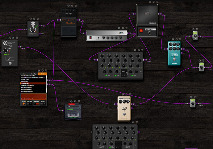
It’s a random MOD pedalboard that includes the WOV by K-devices made in this flat-design, highly readable, minimalistic UI style. Just look at the difference in the number of controls per space used in contrast to the “cool and shiny” stompbox behind it. I’ll make this even easier for you guys:
Back when I used to own the Dwarf I liked the UI for like a week, before I actually started to create pedalboards, because at that point sound and ease of use take priority. And sure, I like good-looking skeuomorphic Neural DSP plugins (or the newest Line 6 ones) but a self-contained suite with separate pages for every section can get away with that. When I pick a compressor that will be a part of a long chain in my DAW I will 90% of the time start with the stock Ableton one. Not because it’s always the best tool for the job, but because it’s always the easiest to use.
I think you’re addressing the biggest Threat in the SWOT here and I agree with your statement.
It’s clear that it won’t be a problem to find people that can help in this but a “community” needs direction and MOTIVATION as well to maintain a momentum. The aim of the momentum should be: having the ever growing library of plugins. The secondary objective is to ensure usability and variety in the library. (a.k.a making) sure you don’t have 500 variations of the same reverb, all looking the same.
The development of the “house style” is crucial to have several people develop front end in the same style. I like the example you have given while it still could do better in efficient use of space. combined learnings can bring this “design system”. At my daytime job, we are currently developing a design system and trying to get as much as possible in an adoption process. It is not only style elements but also a code base and a set of guidelines. in other words, a design system isn’t only a set of components. I wanted this for years and now it’s finally happening. I can’t help but feeling MOD needs to have something theirselves BUT ensuring the influx of new quality plugin still is a slightly higher prio.
Clearly, I don’t know as much about the market as you but I can feel the risk of dried up influx in a risk.
Leaving all responsability to the community would be easy but MOD doesn’t do that. They take it upon them to govern releases of new plugins. Perhaps they can help getting people together, teaming up fornt-enders with developers/coders and an extra guy to help with publishing and promotion of plugins, per plugin or per project? It kind of happened in this thread and @brummer has proven to be the most active here from the dev side. Imagine the delivery power of both the GOOD sound, GOOD usability, GOOD looks (confirm design system) and GOOD promo?
I got into this MOD thing, knowing I would be partially responsible for its success.
Pointing out this risk might be the obvious kicking in of an open door but the ideal pitch to initiate ideation on how to find different methods of actually delivering plugins that score well on ALL fronts.
Although I respect, understand and even personally agree with some of the points that you raise here, I also feel that you are simply ignoring a big part: the MOD platform are not just the plugins.
The MOD platform is now 3 main devices and 2 Control Chain devices (and one more in a long development journey) actively supported, are the features for the 3 of them (besides of the plugins, but the stuff that you can see on the settings, etc. and it’s not “editable” or developed by anyone but the MOD team), is a WebGUI that (even with all its flaws) serves 3 devices (actually even more if we consider the online MOD and the MODEP), the pedalboards feed, etc. Then it’s also the business that needs to be run, the procurement of parts for (now) 5 devices (the MOD Duo is not currently planned to have a new batch), the promotion/marketing to sell more devices that would support the platform and, for example, the accommodation of the latest plugin versions and much more that any business needs to carry on.
Obviously in some of these aspects we are now better and in others we are behind. And any business or project in general is always like this and never really gets out of this stage.
Minimising this to the plugins and to our reliance on the community to participate on the development of them I think is quite a narrow perspective.
And I agree with you that there’s a lot of room to improve on that. But also if you read this thread and all the “deal breaker” requests that pop up everywhere in this forum I think you can understand that even if we take care of everything in-house we would need some filtering and focus.
Again, I’m not saying that relying soloing in LV2 plugins is a good solution in long term. I actually totally agree with you on that. But any project needs to take a step at the time.
I agree completely on this. Especially if we consider the fact that the device is also usable without the WebGUI and hopefully in the future this use-case will get better.
To be fair, I don’t think these are actually vectors. Looking at the texture on the rubber, I don’t know how you could do that with a vector image. If it is I would love to know how to do that. These do look really good in my opinion
You’re speaking my language, I have been imagining something very similar to this, only slightly more towards the original pedal proportions but this also works
It is true in a way that this topic is trivial in contrast to many of the current things I’m focussed on at MOD. That’s not to say that it’s not important though.
I can understand the notion that we have a lot of seemingly “pie in the sky” discussions and that we often use the excuse that we’re a small team bit I have to say, for our size, we have done a lot. Just look at our release history.
I’m managing 3 hardware devices currently which is a huge workload but they are all getting to a point in manufacturing where they will need much less work from me and at that point, plugin GUIs will be one of my main focuses.
The design guide and the templates will come, and they will be well informed by the discussions we are having here. While it feels like now that it’s all for nothing, I want to assure you that it’s not. I think this discussion has been really valuable
I don’t think anything is entirely up to the community or entirely up to MOD. Yes we have the responsibility at the end but the stuff that you guys contribute (opinions, information and work) really makes a big difference
I agree that this project needs direction which will come from me. I’m treating this discussion currently as research and ideation. We looking at options and discussing ideas. This will all be distilled into a tangible process design.
I don’t see it as a distant future thing, I see it as the next thing. For me at least.
I’m away right now until the end of April. I will be in the forums still but not actively working. What I would like is if we can keep the research and ideation happening. Also as we said from the start, keep the work on plugin GUIs for right now moving. We are also learning by doing. For that reason what @Kim has been contributing is not only useful directly now for the plugins @brummer has but also for informing the process
When I get back, I think it would be cool if those Interested parties and myself could have a video/voice call. Even if you don’t want to contribute. Just to distill the ideas and talk about how to move forward
ok not 100%. Those on the rubber are image textures (which don’t add much) but even without them the pedals look really great.
If you are interested the editable source is: (you need an account) https://www.figma.com/community/file/810450242885088492
Oh cool I didn’t realise you could get an editable file. That’s a great resource thanks!
Thanks again, I’ve finished the implementation.
A picture may say more then words:
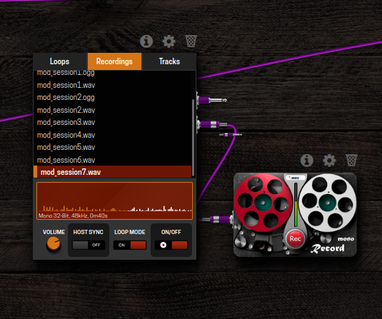
I think this looks really, really cool.
