Hello,
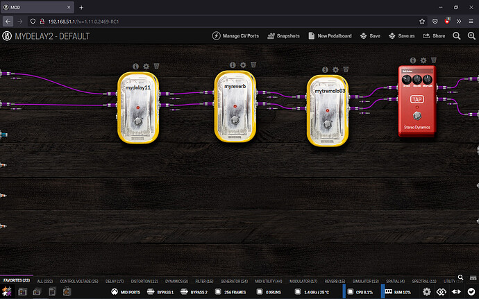
I am using a 1440x900 screen and I spent time to look for the Transport & BPM button that was not showing on the left of MIDI Ports button.
I think it would be doable to make the interface more responsive to various screen dimensions, for example displaying these buttons on two lines instead on one when needed.
Good thing, the transport popup itself shows vertically when needed, for example when docking the window on one side of the screen.
Thanks for reading
Can you post a screenshot of how it looks for you? 900px sounds like it would fit everything…
Yeah I see a lot of space “wasted” by the developer-related options being there.
We have some ideas to declutter these (merging bypass entries, merging cpu temps with usage and ram) but nothing in the direct plans.
For now my recommendation is the same as in the other post, to disable these developer-related options in advanced settings.
1 Like
ok, these options were enabled by default, or maybe by another user so I was not aware of them. Now it’s actually better, thank you.
2 Likes
