@ SrMouraSilva
In my opinion this all is not necessary. My recommendation: Use a tablet or your mobile for that. Connect it via Bluetooth and you have full controll of the entire pedalboard even. It works the same way as on your PC. I always have a cheap Samsung tablet with me exactly for fine tuning. The Dwarf is fully editable on that, you can even exchange effects, build up complete new pedalboards etc. It connects via Bluetooth easily, fast and stable. For the right Bluetooth dongle take a look here: bluetooth-dongles-tested-on-mod-devices
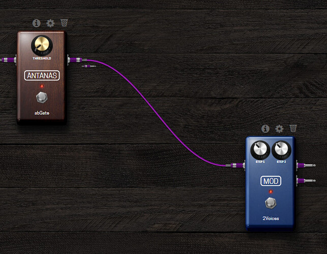
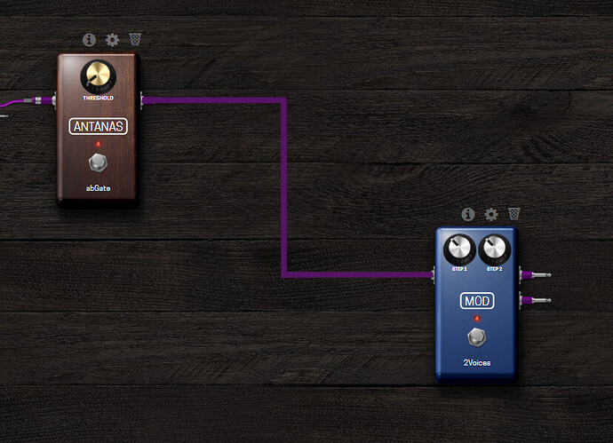
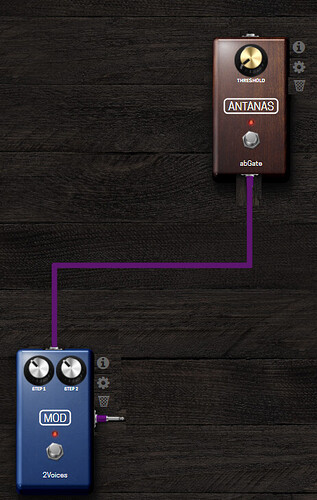
Nice to have: draw cables with 90° angles and ability to change IN/OUT ports side independently so it will reduce graphical mess.
Some examples…
Current cable drawing
Square drawing
Ability to change IN/OUT ports side independently
Improvements on spillover trails
I see some categories on pedalboards site section are not reflected into plugin store.
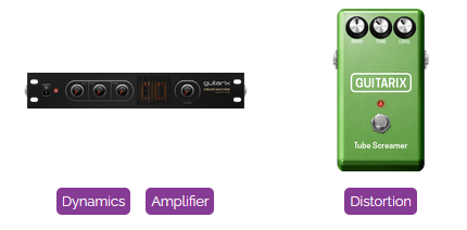
I see Amplifier it’s not shown on plugin store. Would be nice also to have separate categories for amps and cabs.
Don’t know if GxCreamMachine goes under dynamics or simulator. Maybe could be useful to add a plugin to several categories.
Would be also useful to edit pedalboard description and audio file once posted here https://pedalboards.moddevices.com/
Maybe show embedded video player also (Youtube, Vimeo, …)
A feature request related: In control mode I noted that when an on/off is assigned to a footswitch, when is on, the led is fully lighted, and when is off, instead no light, it shows quite light.
A lot of times, I get confused if the state is on or off. Especially when in the same page both footswitches (the middle and the right) are on the same state. For me, it would be more informative (more “mistakeness”) if the off state appears no light instead quite light.
Ok, If I am on the first page, the most left led is fully red. Then, comparatively, I can detect what is in off state and what is on state. But in others pages, it’s more difficulty for me (because of the led colour).
It would be awesome if is possible to turn down off state or, at least change the brigthness.
I 100% agree with this. Would love to have an “Amps” category and a “Cabs” category
I also agree with this 100% with the current categories it makes more sense to me for it to be in “Simulation” however it would more accurately belong in an “Amps” category if it existed. We’ve been talking about this for a while and I’ve been preaching these points a lot too!
The current categories come from the LV2 spec but I believe they could be better tailored to our users and the plugins we offer. This may not change for a while but we do intend to rethink the whole WebGUI and library when the time is right.
What might be more likely is that we would use a tag system where each plugin can be given multiple tags. Then the “Categories” would be more like filters. The cream machine for example, with the tags “Dynamics” and “Amplifier”, would indeed appear in both of those Categories (or filters).
We could also have a hierarchy of filters and sub-filters. For example, a plugin with the tag “Amps” would appear under “Amps” which is a sub-filter of “Simulation” thus meaning that the plugin would automatically also appear under the parent filter “Simulation”. A plugin such as the cream machine, being only the power amp section of a guitar amp, may not fit the description of “Amps” and could just be given the tag “Simulation” or there could be sub filters “Pre Amps” and “Power Amps” under the parent filter “Amps”. This would mean that if it were tagged with only “Power Amps” then it would appear under each level “Simulation”, “Amps” & “Power Amps”. So basically the user would have the best chance of finding it by searching any of these terms while it remains well categorised in a logical way.
We could also tag targetted instruments such as “Guitar” as well as tagging the developer “GuitarX”. It would be interesting to hear what you would think of such a system. It’s all just ideation at the moment and I can’t say what will happen or when.
@James when I was trying to simulate Boss OC3/OC5 I spent a lot of time searching octavers, some I found by plugins list
- SubSynth MDA
Some by plugins store (Guitarix OC2 wasn’t installed in my device)
- Guitarix OC2
Some looking for other audio plugins by bass pedalboard
Some checking manually the description of filter category
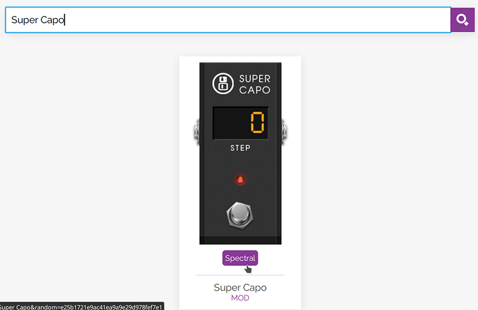
It’s interesting that when I search oct, shows super capo, that add an “octaver” up (+12), but I was searching a plugin to octave down (-12). I thought:
ok, was expected to show an “octaver down” in my search… but, as not show, lets check other audio plugins in the same SUPER CAPO categories
then, I clicked in SUPER CAPO, (because in this page, there isn’t clear how categories super capo is present). Suddenly, this information doesn’t appears on the audio plugin details.
And… if I access directly the plugin page intopedalboards.moddevices.com/plugins, no one category information is related
Ok, I can check some pedalboard that there is using it  , and see the it’s plugins list, but the category flag isn’t a link: I can’t click it to see all the plugins in this category
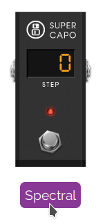
Ok, I can try to search by plugin name, then it’s possible to filter by category
Filtering by Spectral
After some hours of searching, I found other plugins:
- Drop: Drop - MOD Devices
- 2Voices: 2Voices - MOD Devices
- Super Whammy: Super Whammy - MOD Devices
All this searching frustrates me a quite. Comparably, I also a Zoom user (MS 50g / Zoom G3). When I’m trying to find an effect, I only change the effects (one by one) pressing a single button and test it. Try to find an specific effect between 100 is more easily than find into Mod Dwarf because of searching and changing audio plugin to another spends a lot of time (the freedom of connections are a powerful tool but also causes some waste of time when I was trying to test a lot of audio plugins in a specific position).
Other days I was checking the amps and I had same feeling like @redcloud did. After try to discover where are the amps, I just selected the audio plugin that appeared most likely an amp instead try to discover a plugin with the best sound (for my necessity). 
I agree that if I was an expert, I would probably try searching for other keywords instead of octaver, but I was seriously penalized by the equipment because I’m a newbie.
@James, is the pedalboards.moddevices.com source closed, right? mod-ui is open source, then is possible for me suggests a merge-request.
You can actually see there under the title and URL it reads “Category: Spectral”
But I agree with you. A user should not have to go to so much effort to find such a plugin. It should be under a subcategory of “pitch” or something similar.
that would be a good feature for the plugin library indeed!
In the end, you found “Drop” which is what I would have recommended. In my opinion this plugin, when switched to the “Hi-Fi” mode is much better than an OC3/OC5.
You are not alone in this feeling. In fact, I even find the same frustrations searching for plugins myself even when I already know they exist but forget the name or how they are categorised.
Thanks for your feedback! I hope that we can make this experience nicer in the near future but I can’t say when
This is a topic for @falkTX
This is correct, the pedalboards site original code is not even on github, so dont try to look it up in there.
You can actually see there under the title and URL it reads “Category: Spectral”
I need new glasses  , sorry. But a link there would be awesome.
In my opinion this plugin, when switched to the “Hi-Fi” mode is much better than an OC3/OC5.
In my specific case, I was trying to drop down only the low notes of the guitar. I could not (yet?)
Thanks for your feedback! I hope that we can make this experience nicer in the near future but I can’t say when
I thank you for leaving an open space for discussion. 
But a link there would be awesome.
I agree. Something we could implement with the filters!
I was trying to drop down only the low notes of the guitar. I could not (yet?)
As far as I’m aware the OC3/OC5 also does not do this. It just drops all the notes and you have a dry/wet knob to adjust how much of the original signal comes through
In order to drop only the “low notes” the plugin would first need to decide at what point does a note become “low”
You could achieve this by putting a low pass filter before the drop where you could choose the highest frequency to be affected but you would cut out the upper harmonics of the low notes too.
In general, this is not how octaver pedals work. At least to my knowledge
As far as I’m aware the OC3/OC5 also does not do this.
It has a mode called “poly” that does exactly this. It is not perfect, but it is amazing concept. In a different mode it does also the standard octaver thing, when it drops all the notes.
In general, this is not how octaver pedals work. At least to my knowledge
Indeed, this function is specific for OC3/OC5, no other octavers can do this.
You could achieve this by putting a low pass filter before the drop where you could choose the highest frequency to be affected but you would cut out the upper harmonics of the low notes too.
That is the core idea of how to achieve this. I think it is needed to split the signal first, than going trough low pass to octave drop in one path and keep the original signal in parallel path - then you do not lose any of the higher harmonics of the low notes, just add the bass on notes in selected range. However you lose that harmonics in the wet dropped signal, which will more or less change the characteristic of the added bass note. That is the reason that it will probably need a bit more complicated solution. I am really looking forward to dig into this challenge.
Oh okay. My bad! @pavel and @SrMouraSilva
I was thinking they were not so different from the OC2
That’s quite cool! It does sound like a cool challenge to make this as a pedalboard!
Let me know if either of you are able to do it in a cool way! I’m sure @Andre would love to try it out
I don’t know if you guys will think this is superfluous, or if it’s just too late to change the “visual culture” of the established MOD web GUI, but I find it really silly that every single effect needs to both look like and follow the tactile experience of a guitar stomp box.
It took me a great deal of time to even start taking the reverb and delay plugins seriously, start using them, understanding they even SOUNDED good.
as an experienced recording engineer I come from the ProTools culture where these kind of plugins usually feature a GUI that put an emphasis on intuitive controls and an understandable interface in line with whatever kind of signal flow is inherent to the device. Think about how reverb and delay plugins look in your DAW.
And yes of course I know that you can click on the little gear icon and approach things that way, but that is a second level of “drill down” for the user, and possibly strips the user interface of visually helpful features.
Curious if this makes sense to you guys…just seems like to ensure the future of this platform we need to make its interface look less like a quaint and silly toy, given the level the competition is operating at.
Sorry for the long “essay” 
I completely agree with you, and I thought to be alone in this.
I perfectly understand that the “visual culture” of VST effects, synths and pedals relies a lot on trying to replicate the look and feel of the real thing, and I think this was mostty to give us boomers here some sort of psychological support in transitioning to the new virtual wold, but could we move on now, please?
Knobs and footswitches work great on aluminium thingies on the floor. They do not work so well on screens. I already hate moving knobs around when using a mouse. Have you ever tried rotating one using your fingers on a small touchscreen device? Sliders are the good widgets to use on that.
And why do i have to fill all my screen with a photo reproduction of a cabinet for every IR emulator I load in my pedalboard, where the only controls are often a list widget, an on off switch and 1/2 knobs? this is a waste of space and makes my pedalboard so large that I must often scroll to get to all plugins without reason.
I admit that the Mod pedalboard building interface is pretty, but between pretty and usable, I always prefer usable. I’d gladly substitute every graphical pedal with simpler, mostly identical, square/rectangular “boxes”, where you would clearly see numerical values of the parameters (at least the most important if many) and all the other would pop up in a full screen window if touched/clicked, with sliders instead of knobs.
i agree with a lot of what you guys are saying… indeed there’s wasted space and awkwardness in adjusting some things. however, it might be a mistake to go for a uniform plugin appearance; being able to recognize plugins at a glance in a pedalboard layout is something i find quite valuable in more complex boards. i think there’s more value than we might immediately acknowledge in having gotten to recognize a bunch of plugins instantly by appearance… it helps us to quickly parse a board’s layout and function.
…along that line of thought: organization would be helped a lot by the ability to colour plugins, to make labels, and to make functional subgroups of plugins which can be buried within some kind of container and which can be saved and reused. …sort of like functions in programming…
cheers!
.pltk.
…also: i’m gonna suggest that both knobs and sliders are awkward  … i’d like to see a number entry box pop up when you hold on a control without moving. then you just input your new value, hit enter, and the box goes away. …and if the initial delay time was adjustable in settings, we could just set it to 0 so all controls would pop up a value dialog immediately upon clicking!
Nice to have: ability to copy plugin settings across all snapshots with1 click. Currently if you have a pedalboard with 10 snapshots and you want to change a plugin parameter you have to do it manually for each snapshot.
