CURRENTLY IN BETA
Like this post to show support for this plugin’s promotion to the Official Store
What is needed for promotion:
- Plugin GUI
- Legatomode and voices should be enumerated lists
5 Likes
I’ve started working on an interface for the OBXD Synth.
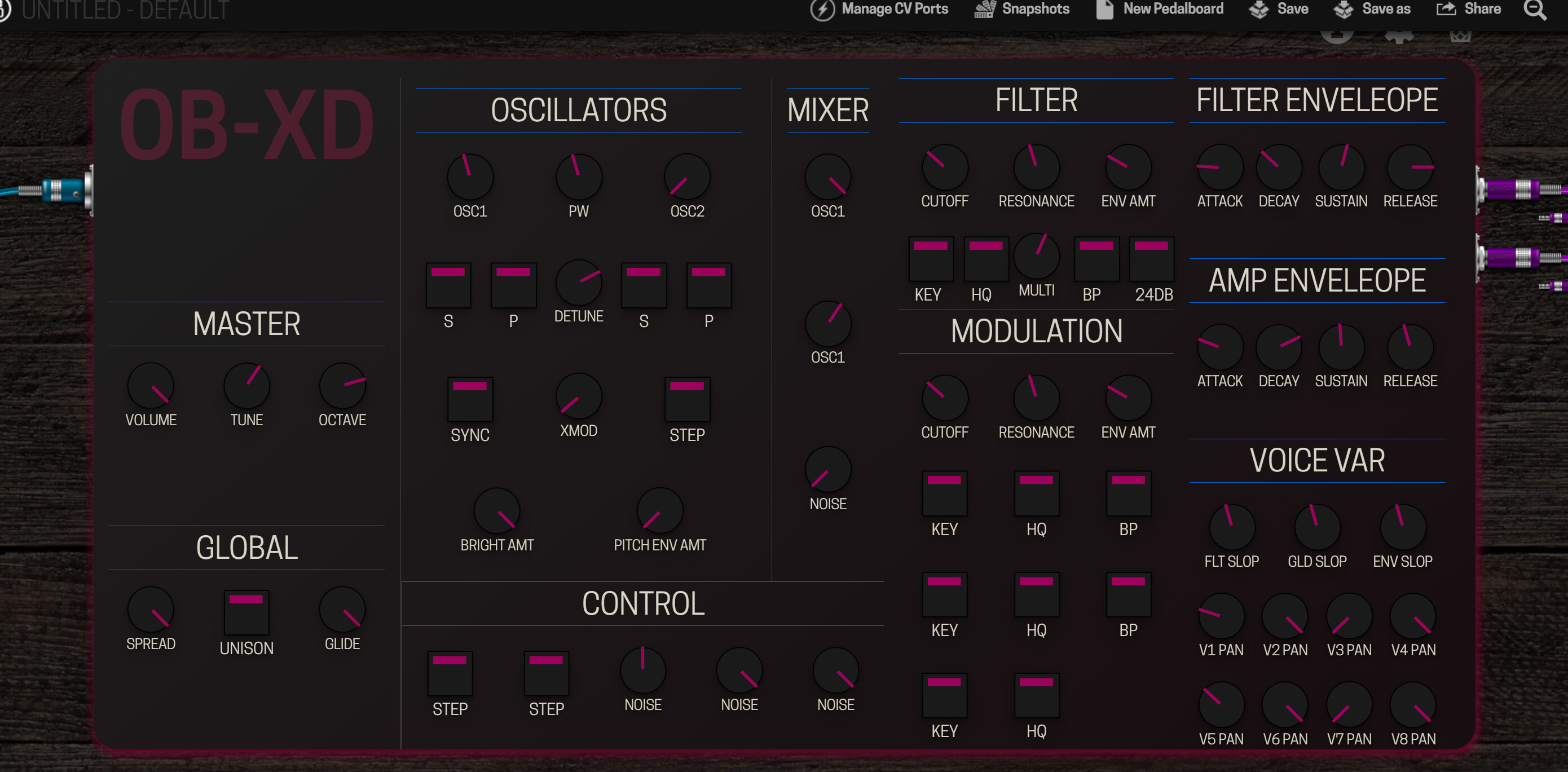
It still early, button knobs and labels need work and not everything is implemented but feedback welcome.
https://s8.gifyu.com/images/MOD-Google-Chrome-2022-06-29-17-34-25.gif
14 Likes
It looks awesome man!
I like the aesthetic of it a lot. It looks a bit busy but maybe that’s just because the plugin has so many controls. Perhaps it can be improved though.
The neon shadow is an interesting touch haha
Great work, very cool to see this happening
MODERATION: Just a little heads up, I deleted the tags as we haven’t yet defined how to use them and I moved the post to the existing topic for this plugin. This is part of an effort towards having a single topic per plugin
EDIT: There is something weird going on because this was an automatically generated topic from the system when the plugin was released. It won’t let me embed in the original post. Perhaps it’s not the best way to do this. I just wanted to have one topic for the plugin with the original date that it was released. I will have to look into how to do this better and may need to move it again. Sorry
4 Likes
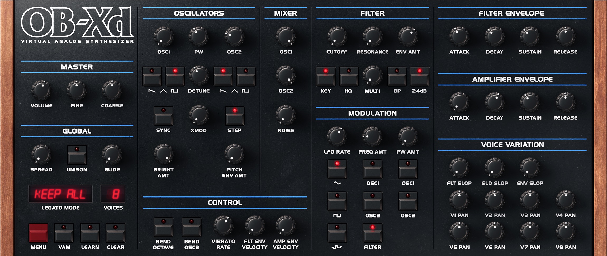
Question: why not go for the official GUI here?
The updated one from the desktop side looks nice
7 Likes
Hello @spunktsch Sebastian,
it looks very promising and the control layout was adopted from the original.
Some control names seem to differ from what I am used to.
Aside from the GUI, can the voice count be modified?
I think the original version had 8 voices, how many voicces should be possible on Duo, DuoX and dwarf?
Greetings and God bless, Marius
2 Likes
That desktop version was my refrence point - I build the same layout as @mj_prod mentioned.
But I wanted to start simple and go from there.
@mj_prod the controls are not finished (copy/paste) and have different internal names.
The voicecount can go up to 32 without a problem on my dwarf.
4 Likes
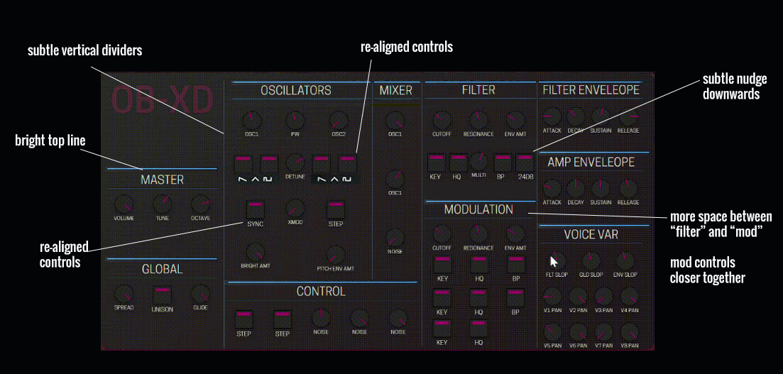
Some feedback on your design
I did some suggestions to tweak for some more eye-comfort whiel staying as true to your initial design
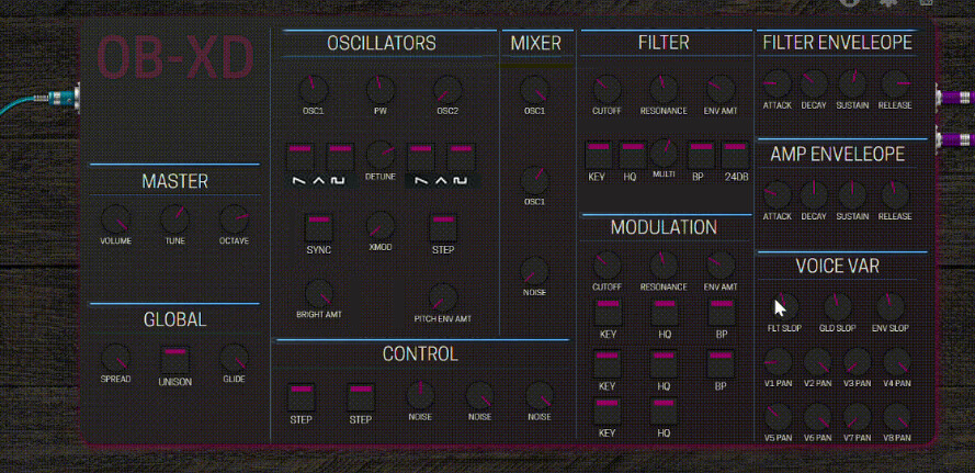
same but with “suggestions made” annotations:
10 Likes
Very nice! I’d put a bit more contrast between the knobs/buttons and the background, though. On my screen it’s very hard to distinguish them.
I assume the buttons will also light up/off when they are (de)selected? 
5 Likes
@spunktsch so sorry for all this messing around with your post. I just wanted to get this onto an “official” topic for this plugin with the original date. I created this new topic and was able to change the timestamp to the original release date. The tag “Plugin” identifies that this is THE topic for this plugin. The reason I didn’t just use your post and change the timestamp is because the topic should belong to the plugin author and if not, then the system, and I didn’t want to take ownership away from you post. Sorry again. but hope it’s okay now
3 Likes
I’m a bit torn between “staying true to the original” and your cool-looking design. In any case, many thanks for your contribution!
3 Likes
I have to say I’m feeling a little bit the same way. I really like the new design you made but the original is also really good! perhaps the assets you made here would be better used on a plugin that has no available GUI yet?
4 Likes
On a quick glance, I like it a lot @spunktsch!
Thanks for this effort, I use this plugin a lot and I believe that I found a couple of simple bugs (some things related to the controls), but the plugin overall sounds great, it’s really versatile and it’s a shame that still doesn’t have a GUI and is in beta. I believe this makes a lot of people not consider it as a valid option when in fact it is a beast!
I agree with you (quite painful to scroll on the assignments view), but the “issue” is that this is a synth (and a really complete one!), so lots of controls are kind of needed.
Yeah…a good point.
2 Likes
To clarify I’m not saying one is better than the other. I’m just saying that to have 2 GUIs for the same plug means one of them will go to waste. Perhaps they can both be used but the new one get’s adapted to a different plugin
I think a reason to replace the original GUI would be if the new one was a lot more compact and maybe easier to use on a small screen
4 Likes
There is no other GUI for MOD. FalkTX’ suggestion is from the desktop version of the plugin, which would have to be adapted.
If possible I’d maybe also just use the same assets (may depend on their licensing). As the layout is already exactly the same.
The design of these assets are certainly nice and should be reused for other UI!
5 Likes
I’m a new user here, so please bear with me.
In my humble opinion (even tough I have 20 years of graphic design behind me), the interface proposed by @spunktsch is FAR superior to the “original” one in various aspects: readability, functionality, ease-of-reduction (which is a concept that’s badly overlooked in graphic design world), inversion, etc.
What’s more, to rebuild the “original” design means you have to acquire the rights to it, or to the assets (knobs, keys).
I read the other posts regarding GUI development and, to be honest, I believe it’s better that mod creates its own visual identity or simply let things flow than try to recreate this or that.
My 2 cents here, hope everyone takes it lightly.
7 Likes
It looks like it’s all under the GPL license
From the website
Thanks to 2Dat for the original OB-Xd and Soshi Studio for giving the rights to continue this wonderful product. Also thanks to all KVR artists for making the amazing skins!. Source code is available under GPL license at GitHub.
3 Likes
thank you for all the suggestions and responses. @James no problem - as long as everybody can see there is new gui related to an old topic im good.
@jon started to use it because of the instant van halen sound and its lots of presets. Which need to be converted next.
I’m also torn between the old and ‘new’ design. The original looks cool (for quickly dialing in presets) but as @delaylover mentioned not as easy to read on a quick glance.
The assets I created are 3 lines for the knob and 3 lines for the button - all svg code. The rest is a css grid with a gradient background and some shadows - again I wanted to start with a bare minimum flat design.
On the plus side: this can be adapted pretty easily for most of the plugins with no ui (eg. Aether is next)
@LievenDV @dreamer 100% - i’ve noticed that I’m pretty rusty all things css and already noticed the lack of contrast and spacing.
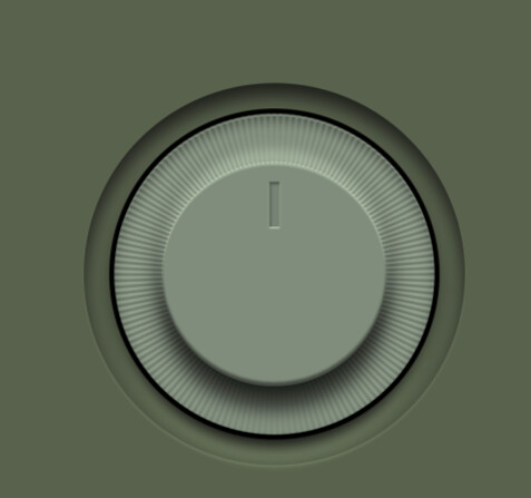
In the long run I’ll try an svg version of these kind of knobs (+ an indicator)

4 Likes
I really like this style of knobs that you suggested in the Plugin Artwork topic with the indicator ring!
2 Likes
Perhaps it would be good to see your design with this style of knobs but with the colours of the GUI more closely following the original GUI and even with the strips on the side
In this case, it is a direct recreation of a real world device so I think the resemblance is useful
I think optimising the scales of things for on screen is a good idea to make things easier to read and use but I feel it would be nice if the colours and textures were a bit more true to the original. Not that it can’t be a “flat” design though
3 Likes
@James, hope I didn’t rub you the wrong way. It is a real world device, I agree, but this knobs in @spunktsch design are much much better to use/read than the original ones under most circumstances, such as low light, small screen, etc. This is just my opinion.
Now the fonts on the original one are certainly better, no question.
Also, looks like it’s been available since 2017 but it’s getting a GUI just now, so to further dwell on a cool design and leave it unattended doesn’t seem like a good approach.
Again, my opinion. No harm intended.
2 Likes