@brummer I will prepare the backgrounds later (I have an appointment now; yes… sadly also on Satrudays I have appointments…). I think it will be ready in the early afternoon.
The Gate button of the Collision Drive is only a placeholder. I did not find the one that you used in the ressources, that is why I created this crude one. Just take yours. Can you provide this to me? Then I can create an appropriate shadow on it and provide the background for Collision Drive as well. Which one is your favourite? this one?
or this one?
To bring up some speed in that process: Is there another PlugIn that needs design??? It is weekend…
Oh, you get me wrong. I like to get the Rumor interface to implement that. For the CollisionDrive I don’t want to change the UI, I like it as it is, except the Gate Button, that is a bit out of angle regarding the rest of the UI.
But while you ask, I like the 2. one a bit more, it have a bit more contrast and looks like the collision will happen in a second. So don’t throw it away, I’ve a couple of plugin prototypes here which I never have released.
Very good article. I think your biases, as you put them, are being confirmed by the markets for the last decade or so. Line 6 went from skeuomorphic POD farm to the flat design in Helix which is so powerful and well-liked by the majority, that it spawned countless imitators.
Exhibit F (Eventide H9000, in before the “bUt MoD DwArF iS sO mUcH mOaR tHaN SoMe SiMple GuItAr Fx” argument)
It’s obviously not the only way but all of the companies behind the products mentioned above want them to sell and all of them are going with function over form when it comes to the UI. Both on their devices and in the accompanying PC software.
Furthermore, I could recreate some of those menus in Inkscape in one evening despite zero graphics talent or competence. Every dev could do the same instead on relying on the community to make a specific design for a specific plugin.
This thread will likely end with like 2-3 people making a few specific designs for a few specific plugins. With concrete enough guidelines, 2-3 people could make enough knobs/sliders/menus/background templates in this specific style to last 100 devs 100 years. If only there were 100 devs actively making plugins for MOD instead of what seems like just @brummer (I will give you props every time I mention you).
I know this isn’t going to happen because MOD is “community-driven” and like @James oh so frustratingly mentioned above “it’s up to the developers”. Well, Android is also “community-driven” and they had enough foresight to introduce material design which, with the benefit of 8 or so years of hindsight, most people would likely judge as a very good call.
exactly my point. And as you mentioned there will always be the gap between what the MOD Team likes the platform to be and what the developer of the plugin want to deal with. Android with the material design is a good example.
Exactly. But keep in mind what that means in turn. Look at the MOD store, there are more then 300 plugs which you get for free, then there are (I don’t know, been it 20 or 30) some commercial ones.
For the free ones, more then 99% of the UI’s been done by the MOD team, as usually a open source linux developer have low interest to support a commercial platform like the MOD.
Done 99% by the MOD design team.
I’m here because I love from the first day on what @gianfranco tries to archive, and now this day’s we are half way there. Look, there are “Users”, become developers, (even if you may call it graphic artist), I said, welcome on the other side.
Most of the plugs I’ve done, the MOD team have created the MOD UI’s for, and I’m gracefully for that. When there are “Users” step in, and opted to create UI’s, and other open source developers get a note about it, be ensured that you could do every single day a UI, each of you.
Time to get the MOD-LABS working, so that we get a space to meat in a working environment.
Hi @brummer
Sorry, I misunderstood that. No problem.
I packed the Rumor background and the red light (on / off) in a ZIP-file, ready for download. I created PNG-files. My red light in my eyes is better as compared to the one that you are ususally using. But feel free to take yours if you don’t agree.
I created white crosses for positioning the knobs, red light and footswitch. The white crosses mark exactly the mid of the sprites (not the centre of the upper side of the knobs).
This is the background design with the auxiliary lines for your information:
I rendered a white chicken head knob in Blender, one time wit scale and one time without. I could make it a bit more brighter, if needed or wanted. The rendered images can be downloaded here.
I created the 3d-model as well as the renders. Thus, it is royalty free and we can do with it whatever we want to!
@James Just some examples of PBR and a good realtime render pipeline. Keep in mind: These are pixels calculated in realtime.
This is an example for PBR-settings plus post effects in a game engine, rendered in realtime (at least 32 frames per second). This is an example of one of our biggest clients, the German Rail (Deutsche Bahn).
Well, the recorder plugs definitely needs a better UI. (Shouldn’t be hard for you to beet the current one)
Very nice, the best knobs I’ve seen was al-time made with blender, and those count defiantly into that circle. Just, one request, if possible, could you render the sprite from 7:00 clock to 17:00 clock instead from 12:00 to 12:00, that is the usual range we use for knobs.
regards
hermann
@brummer This can be taken of the images, strting from Render_02__00027 to Render_02__00042 then Render_02__00000 to Render_02__00015.It is then 32 images. Is this fine? Shal I rename them, so that they are in the right order?
This would be awesome, I’m not sure yet what the best way is to organise it yet but let’s keep going here for now. Also when it comes to files, we could use our git repo or I could even create a shared folder on our google drive. If we all use the same open source software (Inkscape and blender) then it should be nice to collaborate
This can be a bit tricky but still possible, maybe just not in a sharable way. You can, for example, change the background image of your pedalboards. It’s not user exposed though, I think you need to SSH into the device and replace the image. Perhaps we could make options for this available to make it easier to do. The only thing is that we would not want that image to be packaged with shared pedalboards because it is extra data to send and people could share pedalboards with inappropriate images etc.
Another idea that we considered for blocks is to have a list of plain colour backgrounds to choose from. That way you could easily identify and group your blocks by colour. We could also do this with pedalboards.
I don’t think we would have an option for users to customise the look of plugins though just because of branding and stuff. The plugins should probably just have a consistent look that is recognizable
I definitely agree with that. Everyone that’s contributed in this thread is clearly talented. I see a lot of potential here
I still haven’t had a chance to read the full article but the first part seemed intriguing. I generally agree that simpler GUIs are nicer for usability but I do still see the benefit of skeuomorphism as long as it’s done in a really nice way (like NeuralDSP etc). The uncanny valley is the problem for me. As they said, this was a common trend in the 90s when transitioning people to computers. While you could say, okay but everyone is used to computers now, we are also trying to target guitarists who are generally transitioning to digital effects and amp sims sometimes for the first time. So for them, the skeuomorphism is still relevant but it needs to be up to 2022 standards.
This is true, and I am a fan of this trend. A little insider info, Jesse and I have been discussing something we would describe as “simple view” which would essentially be a view that turns all plugin guis into a small coloured box much like the examples you have shown with labels for the name, routings and maybe a little icon to identify it. This could be useful for people who just want to set up some complex routing and don’t use the controls on the GUI. It could also be really nice as the default view on mobile devices connected wirelessly as the simpler view would be much faster to load. As with all the GUI improvements we have been dreaming about, we can’t promise anything yet but it is on the backlog and does fit the current goal of improving user experience in the web GUI.
That is actually exactly what I am aiming for. In the mean time, there will continue to be one off designs being made but there’s no sense stopping that from happening while we simultaneously work on building a guideline and assets together to make things easier going forward
We’re so glad you’re here. It’s not sustainable for us to make every GUI so I’m glad we’re working out how to involve the community more
Amen to that!
This is awesome! nice work. Definitely keep the working files. This looks very usable as it is but I also imagine in the future it would be nice to have a kind of standard blender scene that we could render all models in so they are rendered in the same lighting environment meaning they all look like they are in the same space. Really nice stuff man!
This is really cool. Those textures would be great for the scratched up metal pedal enclosure looks. I think we should try to do everything in blender though so it is accessible to everyone. If you want it to be that is
Yes please, as we need to create a sprite image which is much easier when the image numbers been sorted. If possible, the sprite should at least consist 64 stages, better been 101, the MOD UI could only make steps per sprite, and with lesser image steps you’ll get lesser steps for the controller, means, no fine tuning will be possible.
The 7 to 17:00 renders can be downloaded here. This is for 32 steps. I have to rerender the 64. I will give this to an employee and upload it start of the week.
Yes, I agree, this would be absolutely helpfull. We can prepare a workspace for that. I don’t want to do it alone, I have some employees being much more enhanced in modelling meanwhile as I am. I am managing only since a couple of years and no more producing. Let me have a chat with some guys start of next week and I guess we can create a common workspace taht can be handed over to you after finishing.
that’s what drew my to the platform in the first place. That in theory I can develop (pay someone) my own plugin and have them on a standalone device. Not that I’m even close to doing that but that option is a huge plus.
than most of new designs will be in the hands of the MOD Team. That is good to know.
this looks really awesome. Is it possible to separate the layers (lighting, reflections, color) so that you don’t have to render ever different color or is it easier just to render them all?
this also looks totally rad. Maybe if you have the capacity I would really liked the design of the FatFrog I did be rendered as a real amp and have a comparison to the vector approach.
CSS was mentioned…
I’ve got experience with CSS from a previous job experience and freelancing in webdevelopment.
Curious how far we could take that route.
If that would mean we could still use pixel files as well but make them responsive etc, we could still have designs that would be very complex to achieve on vector only BUT in a scaleable fashion.
when it comes to the “flat” and “simplified” designs:
A flat design is odd because you take a step away from the realism but you DO keep the physical restraint of what size it should have? It’s the “compromise” but in the wrong area if you ask me.
The Helix (and alike)flow stuff; the answer is easy. they have to make it work on a relatively small display on your pedal board and you must be able to work with it on stage as well. Sizes need to be ultra-formilzed to make sure it uses its limited on screen real estate to a maximum.
I wouldn’t mind “strongly suggesting” a limited set of standard sizes so it helps user identify pedals, amps and what not based on size. It could have an optional align to grid, which would be extra beneficial for synth stuff.
Rack view?
The front/back/rack view discussion is interesting. I loathe a view that takes away the overview of the “flow” by cramming them i na rack with wires going everytwhere but getting your controls together makes your GUI more of a “control dashboard”.
Being able to have several views of the same board would be a powerful combo, serving different audiences and applications. it’s a b*tch to maintain though.
@Kim the render of that chicken head knob looks good!
I might not be your biggest fan when it comes to pedal/amp design but if you can render components like this your designs could end up in nearly ALL plugins out there!
That would be cool. I would also be able to have a crack at it but don’t have the time currently.
Not sure what the right term is but I was thinking the user could just upload their own background image from the settings menu. There is a strong reason to not allow custom background images though because of pedalboard sharing, screenshots, videos etc
This should be posible and would be pretty useful
I’d love to see that too
I’d be interested to know your ideas on how this could work
I don’t see it as a compromise. Generally the reason for making a GUI simplified is focus on delivering relevent visual information in an efficient way. Also the size of the plugin is a constraint but stepping away from skeumorphic design can allow you to fit more information in a given space without looking cluttered.
That’s true but we can also benefit from using screen real estate to a maximum, especially on mobile devices.
Alignment to a grid would be a really nice option indeed! We have been trying to figure out how we could make that work with cable routing
It’s a bitch to maintain indeed. But perhaps we can rework the cables in a way that makes things a bit cleaner but this and the last comment are discussions for another thread
If MOD goes down the simplified look, it might mitigate the requirement for different kinds of “views” .
I’m not sure either, CSS was mentioned here but I have no idea what it would imply
I imagine it as containers on a website. If you can make them scale fluently an you can give them responsive properties, I can imagine you can have both gradients and graphics with focal points etc all together. Turning these thingsi nto parameters, could offer more flexibility to the user (fixed sizes, somewhat resizeable items etc)
I think these are 2 different things. Making non-skeuomorphic GUIs (which can be using vector graphics) is about displaying controls and information efficiently and directed at on screen use.
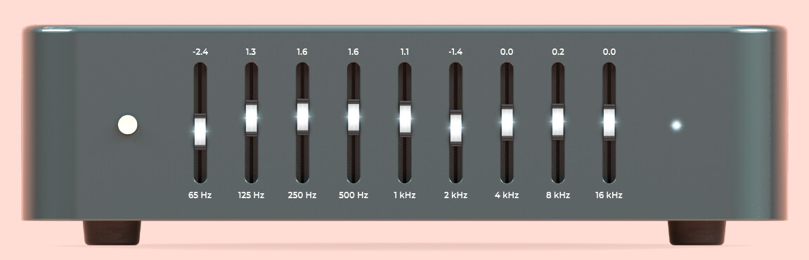
For example, a skeumorphic graphic EQ can look like this, which looks like they do in the real world
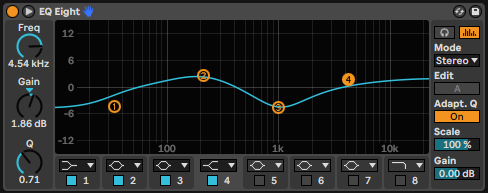
Or it can look like this, were it doesn’t look like the real world but it is argueable more useful
It’s not simplified in it’s controls, in fact it has a lot more going on. It is simplified in it’s aesthetic, as in it uses flat colours and basic shapes. It fits a lot more information and controls in a small space though.
The “simple view” would be a different thing, where plugins are displayed like nodes without controls at all. It would just be for routing and stuff or even would be a way to display full routings on a small display the way it is used on the Helix etc
I see what you mean. I think the problem is the file size of bitmaps. The scaling is less about customisability for users and more about, how does this image display when it is bigger or smaller on the screen (zooming etc). So we don’t want users to be able to adjust the size of things, we just want images that render well at all zoom levels without needing to be high resolution pixel images that take longer to load
 this one?
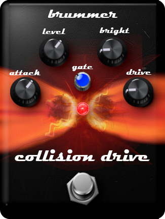 or this one?


 step in, and opted to create UI’s, and other open source developers get a note about it, be ensured that you could do every single day a UI, each of you.