I get you! yeah that’s the plan. I think basically we would have a document that outlines all the dimensions of things as the “Guide” and then a repository full of assets with either working files or layers so that they can be customised with different colours and textures
4 Likes
yep that sounds like a good plan
2 Likes
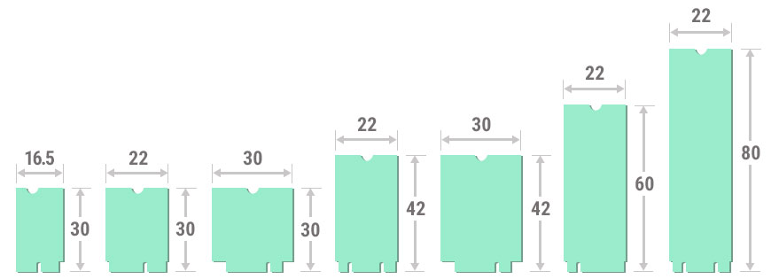
Something simple like the M.2 format factors should fit the bill already. Maybe look at how big the majority of your pedals are already and create categories accordingly.
3 Likes
@LievenDV Gian just showed me that we have a guide for creating custom GUIs on our wiki that might be helpful as a reference
5 Likes
@brummer
Hi Hermann! The FatFrog is very inspiring, I immediately think of new songs when I use it, even though I’m not a high-gainer. It is also a fantastic plugin in the lower-gain range. It harmonizes very well with my Roland Blues Cube amp. It really sounds excellent and very differentiated. Every string is audible, nothing muddy, great! The next great plugin after the Collision Drive.
You’ve done such great stuff now, I figured I had to do something for you too. Maybe you are not interested in it, I don’t know, but it’s worth a try.
First of all, I thought about the branding. That’s something you need to do: You need a brand, so that your PlugIns are taken also gladly. Your name is already program. I am from Germany, there the name “Brummer”, don’t get me wrong, sounds a bit old-fashioned. It reminds me of the 50s, 60s or 70s. Now guitarists are also a bit conservative, still follow Jimi Hendrix and everything has to sound like tube distortion etc.. That’s why your name fits perfectly, especially in the guitar section! I therefore suggest to use your name also in this sense, so in the style of the 50s, 60s.
My suggestion for your brand lettering: Font Magenot Bold semi expanded, lowercase only. You can use it as Marshal sticks the name on the textile front of their amps. It will look like this:

Then I dared to design FatFrog and invested a few hours in it. I don’t know your taste, so I came up with two variants:
A more conservative one: Proposal in form of a real amp:

And now more my thing: A pedalboard amp (is completely en vogue right now) with funny design. When you press the foot switch or the toggle switch for “Bright”, the frog winks at you. ![]()
![]()
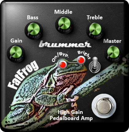
I love strange designs…
I don’t know if I did everything right, regarding the usage in the mod biotope. I might have to tighten a few things, but after a first check it should work like this. Furthermore, you will notice that I have only taken a part from the mod library, I had imagined something different.
@Jon, @James : I can make the single parts I created available for your library after a reprocessing that I think will be necessary.
12 Likes
I like the idea with the LEDs as the eyes in the frog graphic. I’m also a fan of those quirky images in GUIs like the infamous sausage fattener. I prefer the look of the amp heads rather than amps in a pedal. I think the amp head could be made to look more interesting though. It looks a bit generic with just a silver plate, black grill, and black body. Also it would be good to be consistent with the type of textures used. Some parts look very photographic like the amp body and others look more like computer graphics like the knobs and switches and then the text is a very flat 2D style. I think a really good place to draw inspiration is from Neural DSP amp heads. Maybe the frog graphic could be integrated into the amp head style.
5 Likes
To everyone who wants to get into making GUIs, while it is nice for ideating, I think in general, photoshop is not the answer.
It can work if you put in the time to establish a consistent style for all the assets used. You want to have every element look like it exsists in the same universe. Also you want the lighting and shadows to be consistent.
I think Illustrator would potentially be a better option for creating graphics and would allow you to make SVG graphics that can scale easily.
For me the ultimate option is to go full 3D. As in build an actual model of an amp in Blender or which ever software you prefer, put it in a well lit environment with nice textures and render some images of it. I’m 99% sure that’s how neuralDSP and many other companies are doing it and I think it gives the most professional results
4 Likes
@James You are absolutely right. I did not spend that much time in the graphics, it is more a sketch. I did it in Blender, Gimp and Inkscape (all OpenSource). 
3 Likes
Maybe I should have used open source software in my references. Let’s just say
Pixel based editors:
Photoshop, Gimp etc
Vector based editors:
Illustrator, Inkscape etc
3D Editors:
Blender, Cinema 4D, Keyshot etc
2 Likes
@Kim I love a few things on your post. The spirit of community, the willingness to help, the immediate bring to the table some clear ideas and…the frog with its eyes haha
I’m totally into this idea as well
@Jon Ok, let me try this… I don’t have the files with me now but I already have an idea. I will get back after finishing a sketch.
2 Likes
Wow, how nice is that!! What a nice idea. Really love it and will already use that one.
Well, yes, . .
![]()
2 Likes
Ok, I’ll shelve the amp head style idea?
(Good thing I didn’t start designing yesterday based on my mockup)
@LievenDV oh sorry Lieven. I didn’t want to jump the queue. I hadn’t read that you were also doing something.
Nope, love your mockup as well and would use it as it is already as well. Both mockups are fare better then what I could come up with. While I love the metallic design of:
image
I love as well the colours of the frog pedal. Sorry guys, I don’t know what to do now.
I’m very proud that you guys offers to help me out of my limited graphic design skills, and wouldn’t make a competition out of it.
3 Likes
But still I’m eager to hear what you think about the sound of the frog. 
2 Likes
No worries, my reply with the mock-up was on an odd place, as it was a follow up on @brummer referring to the amp in the MetalTone thread.
It’s cool to see you are willing to help with front end designs as well; Brummer (and every other dev’er) has options now 
@brummer : I’ve been experimenting with it with the dwarf on my desk and a guitar DI signal (prerecorded) and I hope to give it a live spin with my guitar real soon…family sleeping, day-trip,… I wanna jam!
I have some first feedback ready but I need to check some of my own gear to be complete
1 Like
@brummer
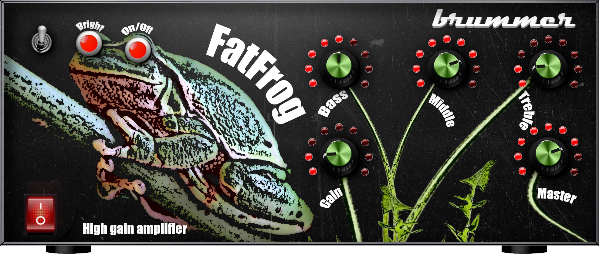
I again created two designs. I had a few more ideas that I wanted to put into them. @James, @Jon: It’s an amp head now ![]()
The first design is the well-known frog. I saw a conceptual problem with the knobs. I wanted to avoid them being conceptually unbound, so they are now flowers. ![]()
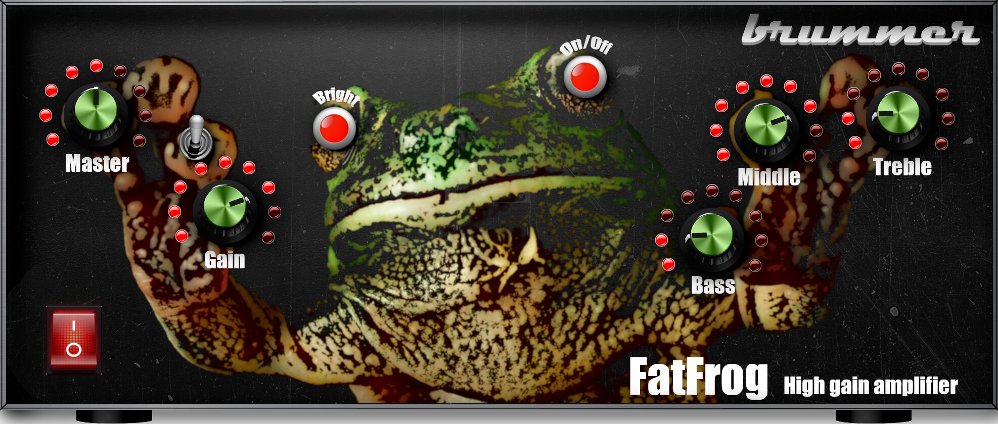
The second design: Here the frog literally has everything under control. That’s why he fiddles with all the knobs at the same time.
Which one do you like better? Whit which one shall I proceed… or, shall I proceed?
9 Likes
yooooooo these are really cool!! super creative
I think I like the bottom one slightly more. The frog looks like a tough frog that is a fan of fat tones haha
From a control layout point of view I would say maybe it would be good to put the master on the right side just so it’s consistent with other amps that people are familiar with.
It’s a great concept, nice work man
2 Likes