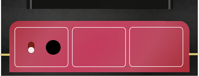
@spunktsch Very cool effects! This gladdens my playful heart! I really like it!
We are working on something to collect people from the community interested in helping with this and other tasks and kind of organize the efforts.
The first step is indeed to measure the interest, the following will be understanding/mapping the plugins on such stages and later which ones you guys (all users/community) think are worth the effort. In a huge summary, this is keeping me quite busy at the moment.
@spunktsch
That looks great!
love how you guys are aiming for the middle ground between code+vector and realism.
The gradient animation is cool and could even develop in something functional, like gain/clipping indicator etc ![]()
minor remark: I can’t read the aidi dsp logo (or what does it say).
You’re teasing us, because the Mutant is one of my fav’s!
Would you mind sharing the code and svg’s for the front-end?
It would give me insight in how these are connected.
@Kim alright, let’s wait for MOD (via @jon ) to converge community efforts and see what’s cooking.
thanks. Animation could work well with a gate triggering a tube effect.
I’ll plan on releasing some snippits and teasers for when this is ready and MOD is clear on a roadmap.
The logo and other things need to be fixed for version 1.0. You can head over to github and check out my pull request.
Good to know. When done right this should be a flaghip plugin for the dwarf.
I must say, it’s a simplified SVG design that gave me instant VOX vibe.
Perhaps you could create a bit more depth when needed with an extra border (like described here)
btw your image is rendered as png, did discord auto-convert it?
I put 2 images in my post, the first should be the SVG, the second a PNG version, due to the SVG not rendering the correct font.
Ah yes indeed
I just did my first steps into SVG editing so don’t take this design as “finished” or “polished” ![]()
The tolex structure is a surface of triangles
It still looks cluncky and childish but I’m getting a hang of it.
hey! That’s great! I like it already ![]()
Hi Guys,
How do you go about setting up the MODGUI files to support SVG rather than bitmaps?
Cheers
Andy
it’s html and css. Just use it like in any other context or look at the various plugins in the github repos.
played around with this a bit more this evening. I think I’ll try building a MOD GUI with this.
I’m getting more familiar with Inkscape. I like it! I fixed the font rendering issue by converting all the text to paths instead of using fonts. Hmm… not sure why the “GAIN” under the first knob isn’t showing up. Odd. if I load the SVG in firefox, it’s fine, but for some reason, the copy uploaded to the forum drops the word “GAIN” under the left-most knob.
Probably need to scale the knobs down a bit so they don’t foul the white border when turned.
I never understand what this move to svg graphics should gain us. Okay, it’s scalable, but why is ii? because it simply have no details. However, give it my love.
it does not have to be one or the other. if you use a high-dpi display, the blurry images are awful. and shipping 1.25x, 1.5x, 2x, etc versions of graphics is a waste of disk space.
Look at the new wolf-shaper that was pushed into beta yesterday. The GUI is 100% scalable and it is still nice.
Yes, generate the UI at runtime is the very best one can do.IMO.
that is what CSS does actually. and mixing scalable graphics with CSS (even animations) is possible.
one can also mix svg inside the html, or use svg for knobs and other widgets while keeping the outer modgui still html/css/js based.
for examples of good looking scalable UIs, we have for one Plugins & Instruments - FL Studio
I know pretty much all of those plugins are scalable.
and dont forget the whole VCV Rack (plus Cardinal) collection. they are scalable with mostly SVGs, with a tiny bit of code for light bloom and other small details.
I’ll add that using an open, “human readable” format means people can re-use existing designs and customize them using text editors, (the freely available) Inkscape, and many other tools that are capable of working with SVG. The same file can then be used in multiple contexts like the pedalboard UI, plugin description pages, marketing copy without losing fidelity.
That’s more a result of the combination of my preferences and the limits of my abilities ![]() It is possible to create very detailed SVGs
It is possible to create very detailed SVGs
Wow, that’s really ambitions. I mean, I’ve written a svg2png converter for my widget toolkit, to add support for svg graphics, but, editing a svg file with a text editor is far above my skills.
Even more I feel comfortable with convert a png file to a char array and edit this and convert it back to png.
What I mean here is that svg graphics in most cases simply miss details, and, when those details been given in the file, it doesn’t mean that they are supported by all frontends. So, it is in my view a lossy format. Special when it comes to web frontends it may, or may not look like you’ve expected, simply because it is “just” a instruction file which may be resolved different by different frontends.
If you invest a bit of time to check what those will be, it is quite straight forward to then realize what is possible and what is not.
We pretty much only have 3 browser engines at this point, and the Chrome Blink one is originally based on WebKit so in a lot of cases it behaves in a similar way. So it is more realistic to say we only need to check 2 “frontends”.
We can search and define a set of rules alike what VCV did, where the target render is known so they can state the known limitations. See VCV Manual - Panel Guide
One kinda obvious self-imposed limitation is to not allow custom fonts, always have text converted into a path. That fixes the issue of text looking different across systems.
Avoiding complex gradients and color FX perhaps too, although Inkscape supports those we know other tools will not.
Additionally, in my opinion, shadows should be avoided and instead written as needed with CSS.
I would also say any common widget background that is present more than once should become its own separate SVG.
Agreed. It’s a trade-off of the format. Nothing comes for free. A trade-off with PNGs is that the file sizes tend to be significantly larger compared to SVGs. When we’re talking in the context of users operating a web interface over a Bluetooth connection, file sizes matter quite a bit. Users will definitely “lose” some of the experience having to wait for a bunch of images to load.
Ambitions are relative it seems ![]() My bet is that for most people, if you asked them to modify an attribute of one of these images:
My bet is that for most people, if you asked them to modify an attribute of one of these images:
<svg height="300" width="300">
      <circle cx="150" cy="150" r="100" stroke="grey" stroke-width="5" fill="purple" />
 </svg>
…almost everyone would have more success with the first one. Anyway, that’s an edge case - I wasn’t talking as much about creating new graphics by hand in a text editor - more that it is a human-readable format. Almost everyone will use an SVG-capable graphics editing tool like I mentioned. Just like it is possible to edit the human-readable pedalboard files but most people will prefer the web builder interface as a more intuitive and enjoyable experience.

