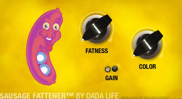
Another perfect example of wasted space. There are many others in the plugin library, unfortunately.
Hi @Kim
Sorry for delay in my response.
Well, I really love how the frog comes out, it’s really ‘in your face’.
Still I think that this design didn’t suite the representation of a amplifier simulation.
While as a pedal design it works great, in the amp design it becomes to restless. When I look at it I must think on a DJ-tool instead a amp. Even if it looks great with the cigarette and the smoke.
Yes, I think so as well.
So, sorry @Kim, I think I’ll go with the design pattern from @LievenDV for the FatFrog.
But, maybe, you like to do such a fancy UI for the Rumor pedal, for that, the UI can’t be strange enough, as, it is a pedal, it produce strange sounds.
regards
hermann
3 Likes
@brummer: I did learn a few things from this thread. It was a fun excursion into foreign realms, but I think I’d better stay in my gaming industry, where there’s a lot more imagination possible than here. You’ll find someone who will design your really fantastic plug-ins. In any case, I’m no longer involved (some people are breathing a sigh of relief right now  ).
).
4 Likes
Don’t be discoraged @Kim; I love your enthousiasm and It would be a shame that you gave up on this because I challenged the concept.
I can imagine you designing A PEDAL that offers the the combo of “classic expected layout” and “fresh graphics” like the Warlus Audio pedal you posted.
It is wild but monochrome; a compromis.
I think your designs should have a compromise too; your amount of quirks might be too much when having “many” colors, knobs in an arc, green buttons, leds etc.
I think pedals lend themselves better to dedicate that percentage of “real estate” to quirkyness and graphics.
Let’s continue to challenge each other; this is not a competition but a place to find each other
I find my design still just a tad too “bland” and your design on the other side of the “compromise” inspires me to improve it, bring a bit more panache, a more vivid element or something…
Take this Trashy Blonde v2 pedal for instance. It is, without being a pedal, an excellent illustration and an upgrade from their v1. It’s design just falls short of “the compromise” though.

it uses mostly 2 color and a color very close to the enclosure color.
I find the knob section somewhat confusion already though.
The control layout is ALMOST on one line but it’s the colors there that make it a bit busy.
Finding that balance isn’t easy and manufacterers do hit n misses themselves.
Wanna see a gallery of hit and misses? Check Dr. No effects
3 Likes
I quite like the cartoony vector art style here
1 Like
yeah, that is a compromise too:
it’s a graphic but it is not a picture, it’s an illustration with a certain simplicity.
The simplified lines and the early 20th century cartoon esthetic are the signs of well thought concept
Simplifying lines is a fun challenge btw. For some boardgame design concepts, I tried giving animals a “role” and express them with simple lines:


Even though 2 shades of a color still work best on a pedal. This could be the sketch of center graphic of a treble boost (a small drawing on a notebook)

5 Likes
Hi! interesting to follow this debate/reasoning. Yet I fail to understand why one thing excludes the other. Couldn’t the plugin be released in both versions, and the “tin can” version for that matter? Then one could also see what the public actually prefers over time. I personally think the plugins would have a stronger/longer “memespan” (I don’t know if it is really a word) when they stand out visually as original artworks. The frog will definitely stay with me as it has a strong visual imprint. Maybe not quite “Pepe” but that’s probably a good thing  Personally the visual side isn’t so important for me, as i like my pedalboards as clean as possible. But to see you guys visual creations is a great edition to this forum. Which I already enjoy a lot, for some reason. Must be the strong atmosphere of co-creation and supportive problem solving! BTW I think a lot of people might love the possibility to “paint” pedals here in their own fashion. As far away from music as it may sound. Could/should modularity be restricted?. Especially when seeing how music is developing. We used to make songs and albums, now we create pedalboards/modular patches/soundscapes for others to navigate and play with. So why not a “cover” or visuals to go with the “creation”? Although it somehow touches on the phenomenon of territoriality and identity. Sorry for being a somewhat off topic philosopher. Just my creation of words this evening! Stay creative and keep keeping on!
8 Likes
Agreed!
Did you just made that up?
Brilliant
4 Likes
Well one can never be sure where’s thoughs originate. It stood between that and “memeability factor”. Just envisioning how these great devices can reach even more people.  And the internet works in mysterious ways. Don’t underestimate the power of bad/good design/taste and frogs
4 Likes
The current multi-fx market is basically turning into UI wars. Sound quality-wise, a decade-old technology can still be useful to professionals (Kemper), and the newest, most powerful kid on the block (Quad Cortex) is not blowing pro-level tech from 7 years ago (Helix) out of the water when it comes to the sound. The newest Boss product (GX-100) does not offer any technological leaps in the realm of sound quality when compared to their flagships from like 4 years ago, and all of the improvements are in the UI realm (colored touch screen, Helix-like material design UI, more streamlined approach to signal-chains).
I know that the MOD team is small and they have their days full, and I’m not even a MOD user anymore (I briefly considered diving back in given how hard it was to get an HX Stomp with the chip shortage, though this topic coupled with no MOD-team driven progress in the amp-sim department, cured me of that notion) but what this topic is about should probably be a top priority.
4 Likes
didnt ohm force have different skins for their plugins?
 Sorry to see you leave the discussion. Thanks for the frog design though… it was a novelty that made me chuckle!
2 Likes
These are some nice illustrations man! You could definitely put these into illustrator or inkscape to make some really nice, clean and colourful vector art
like this one
and this one
and this one 
there’s a really easy way to do this in illustrator with the “live trace” feature
1 Like
To bad. I guess it wouldn’t help if I tell you how many attempts I’d made to create a UI for the FatFrog, without ever been really happy with it.
3 Likes
Why bad? The target is achieved! You now have one (unfortunately not more, the reach of the Forum probably wasn’t enough) that will give you good design for your plugins. First and foremost, the goal was to prevent this from happening (sorry Lieven, I know, I am again too hard…):
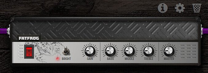
This is a steel-amp and not a fat frog… We need to come up with better ideas that are also conceptually well thought out. And Lieven can do this.
1 Like
@LievenDV this is just a quick example using your drawing of how it can be turned into vector art in Illustrator using live trace with some little cleanup. It’s best if the source image has very high contrast so like drawing with a dark black pen on very white paper so the edges are clean when converting to vectors
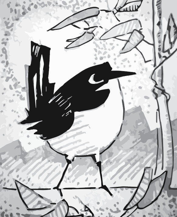
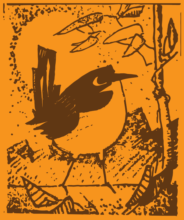
These vector images could also be used as maps in a 3D rendering software. For example, in the images I made of the Laser engravings on the Dwarf, I could instead use a vector image of this bird which would then look like it is engraved and indented into the material
2 Likes
Nope. The target of this thread isn’t “create a UI for the FatFrog” but “Plugin Artwork”. Thus means, there are a couple of plugs, idle in the beta store, waiting for a UI. Not only some of mine.
And you’ve proven already interest and skill to help us out on that. It would be a pity if you throw the towel just because I prefer a more metallic interface for the FatFrog.
6 Likes
Hey Hey
7 Likes
I have that Julianna pedal. Used to trade gear with an employee there.
A lot of my pedals have artwork on them, and my synths are even busier on the aesthetic side of things.
I actually like the frog design, and how the eyes and fingers are controls.
I’d ditch the cigarette, we smoke meth around my parts.
Just kidding, don’t let that frog do a poor man’s drug.
Also a joke.
I personally like seeing pedals with flair, 90% of the time I’m looking at the detailed parameter menu, so the graphic really only applies to the gui pedal board, and no one but me ever sees that.
However this resolves, it’s awesome to see you guys working on helping out!
5 Likes